
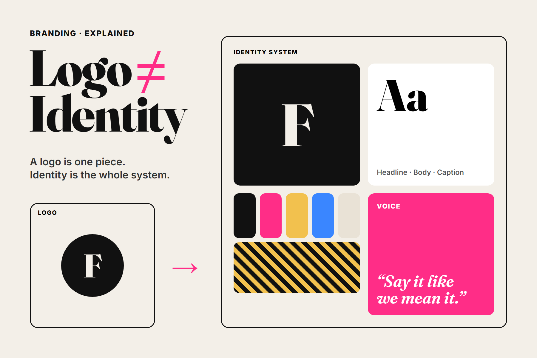
“We need a logo” is one of the most common ways a branding conversation begins. It makes sense: the logo is the most visible symbol of a business, and it is needed for everything from a signboard to a social media profile.
But customers rarely recognise a brand by its logo alone. They recognise the colour of the pack on a shelf, the style of the photography in their feed, the tone of the messages, the way the website feels. That wider system is the brand identity, and the logo is one part of it.
A logo tells people who you are. A brand identity makes sure they recognise you even before they see the logo.
What is a logo?
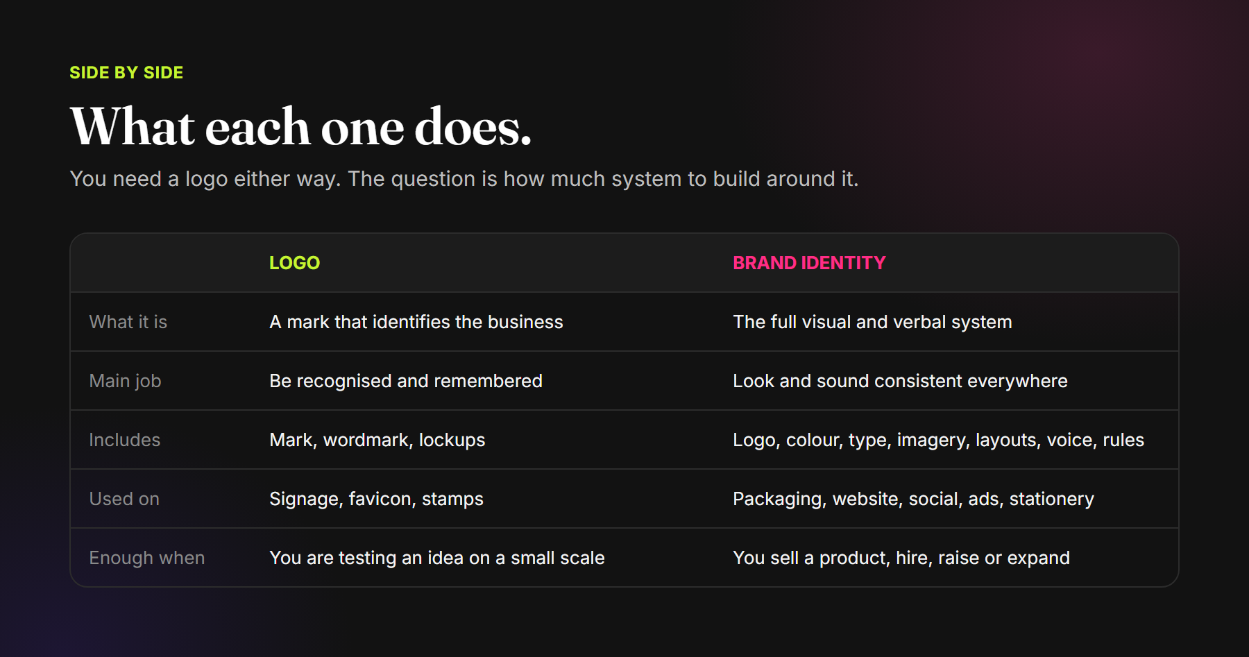
A logo is a mark that identifies a business. It can be a symbol, a wordmark, a monogram or a combination. A well-designed logo is simple, distinctive, and works at every size, from a favicon to a shopfront.
A professional logo is usually delivered as a small suite rather than a single file: a primary version, a secondary or stacked version, an icon for small spaces, and versions for light and dark backgrounds. Clear-space and minimum-size rules keep it legible wherever it appears.
What is a brand identity?
A brand identity is the complete visual and verbal system a business uses to present itself consistently. It gives every touchpoint, including packaging, website, social media, advertising, stationery and signage, a shared look and voice, so that each one strengthens recognition instead of starting from zero.
What a brand identity usually includes
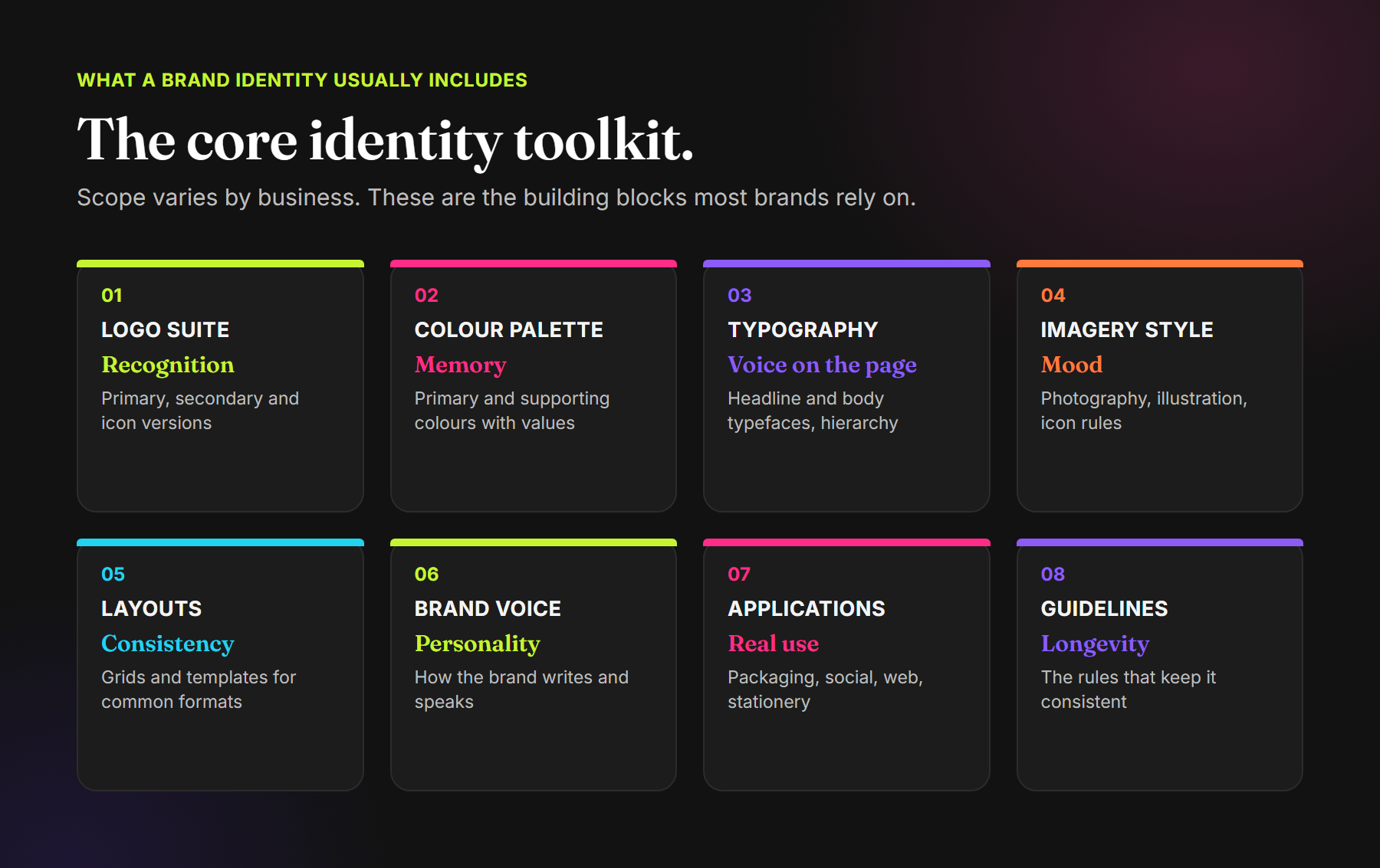
The scope varies by business, but most brand identities are built from the same core components:
- Logo suite: primary, secondary and icon versions with usage rules.
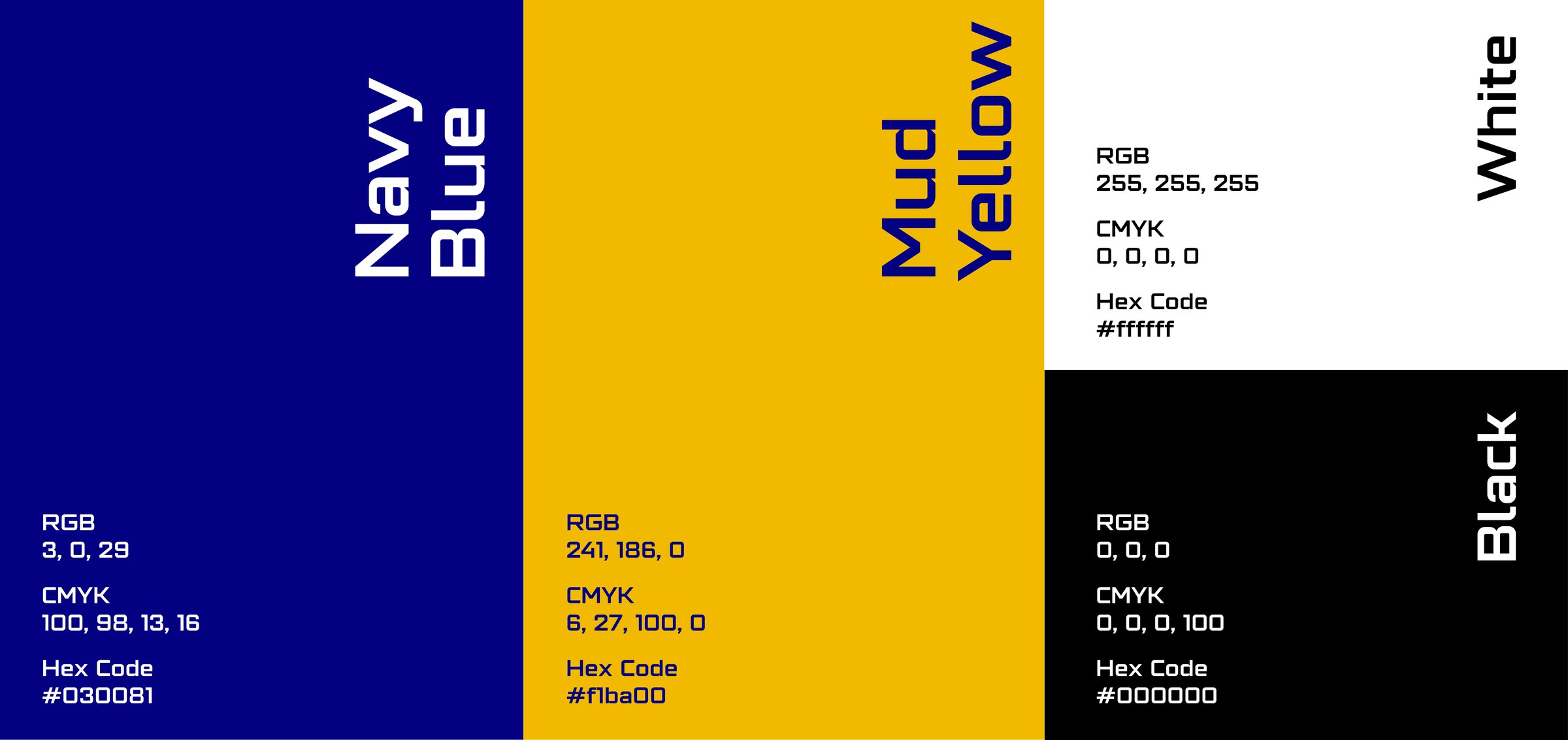
- Colour palette: primary and supporting colours, with values for print and screen.
- Typography: typefaces for headlines and body text, and a clear hierarchy.
- Imagery style: how photography, illustration and icons should look.
- Layouts and templates: grids and ready-made formats for the materials you produce most.
- Brand voice: how the brand writes and speaks, with examples.
- Applications: the identity applied to real items such as packaging, stationery, social posts and signage.
- Guidelines: a document that explains the rules so anyone can apply the identity correctly.
Why a logo on its own often falls short
A logo without a system tends to be applied differently by every person who uses it. The social media designer picks one set of colours, the printer another, the website developer a third. Over time the business looks inconsistent, and each new piece of material has to be designed from scratch.
- Recognition builds slowly: customers see a different look at every touchpoint.
- Quality looks uneven: inconsistency can make an established business feel less reliable.
- Every job takes longer: without templates and rules, decisions are made again each time.
- The logo carries too much weight: it is asked to express everything, which usually makes it more complicated.
When a logo is enough, and when you need more
A logo on its own can be a sensible start when you are testing an idea, operating at a small scale, or working with very few touchpoints. A simple logo with a basic colour and typeface choice will carry you for a while.
You are likely to need a full brand identity when:
- You sell a physical product and need packaging.
- You are launching on marketplaces, quick-commerce apps or your own online store.
- You produce regular social media content or advertising.
- Several people or agencies create materials for the brand.
- You are raising investment, hiring, or entering new markets.
- Your current materials look inconsistent, or the brand has outgrown its original look.
How the two are designed together
When a logo is designed as part of an identity project, it can be simpler, because it no longer has to carry the whole brand alone. The process usually starts with strategy: who the brand is for, what it stands for and how it should feel. The logo, colours, typography and imagery are then developed together and tested on real applications before anything is finalised.

Common mistakes
- Starting with the logo instead of the strategy: the design looks good but does not say anything specific about the business.
- Following a trend: a look that feels current today can date quickly.
- Testing only on a white background: the logo fails on packaging, photos or dark screens.
- No guidelines: the identity is applied inconsistently within months.
- Too many colours and typefaces: the system becomes hard to use and hard to recognise.
Frequently asked questions
Is a logo the same as a brand?
No. A logo is a symbol that identifies the business. A brand is the overall perception people have of it, shaped by the product, the service and the brand identity. The logo is one part of the identity.
What is the difference between brand identity and branding?
Brand identity is the set of visual and verbal assets: logo, colours, typography, imagery and voice. Branding is the wider process of shaping how people see the business, which includes strategy and how the identity is used over time.
Can I add a brand identity later if I only have a logo now?
Yes. An identity can be built around an existing logo if the logo is strong enough. Sometimes the logo is refined during the process so it works better within the wider system.
What files should I receive with a logo?
At minimum, vector files of each logo version, plus PNG files for everyday use, in colour, black and white versions. Colour values and simple usage rules should come with them.
How long does a brand identity project take?
It depends on the scope, the number of applications and the feedback rounds involved. A focused identity is quicker than one that includes packaging for a full product range or a complete set of templates.
Build more than a logo. Build something people recognise.
Brand Strategy · Logo Design · Visual Identity Systems · Brand Guidelines
See identity work for Delta Cargo, Fitleasure and Young Veda, browse our logo folio, or explore our Brand Launch services.
Comments