
A toy brand given a wordmark that feels like play itself, anchored by a deep plum base that lets every colour shine.
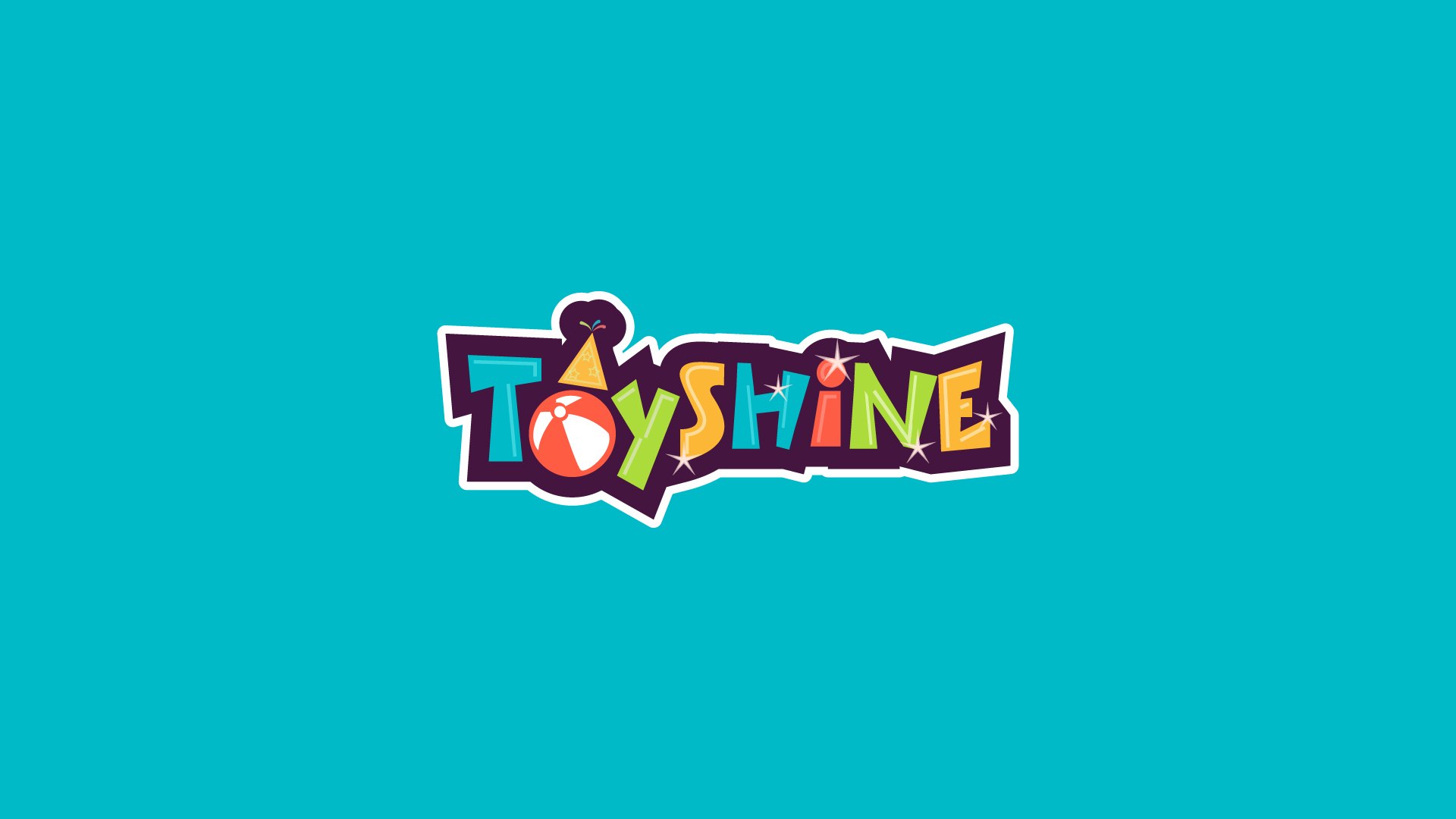
Toyshine is a toy brand, and its identity needed to feel like the products: bright, energetic and made for fun, while staying clear and recognisable wherever it appears, from a shop sign to a small label.
The logo is built from hand-drawn letterforms, each in its own colour of teal, lime, orange and yellow, and each set at a slight tilt so the word seems to bounce. The O becomes a beach ball topped with a party hat, and small sparkles gather around “shine”. The letters sit on a deep plum shape with a white keyline, which holds the playful lettering together as a single, sticker-like mark that stays legible on any background.
Deep plum is the brand’s anchor. It gives the multi-colour wordmark something rich to stand against and brings a more considered, premium feel to materials that could otherwise become noisy. A line-drawn pattern of toy icons in plum and white adds texture and character without competing with the logo.
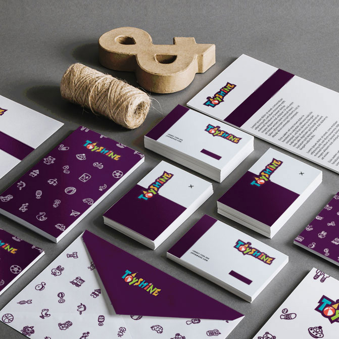
Across letterheads, business cards, envelopes and notebooks, the system alternates between white and plum surfaces, with the wordmark and toy-icon pattern used consistently. The result is a set of materials that feels unmistakably Toyshine, whether it is a single card or the full kit laid out together.
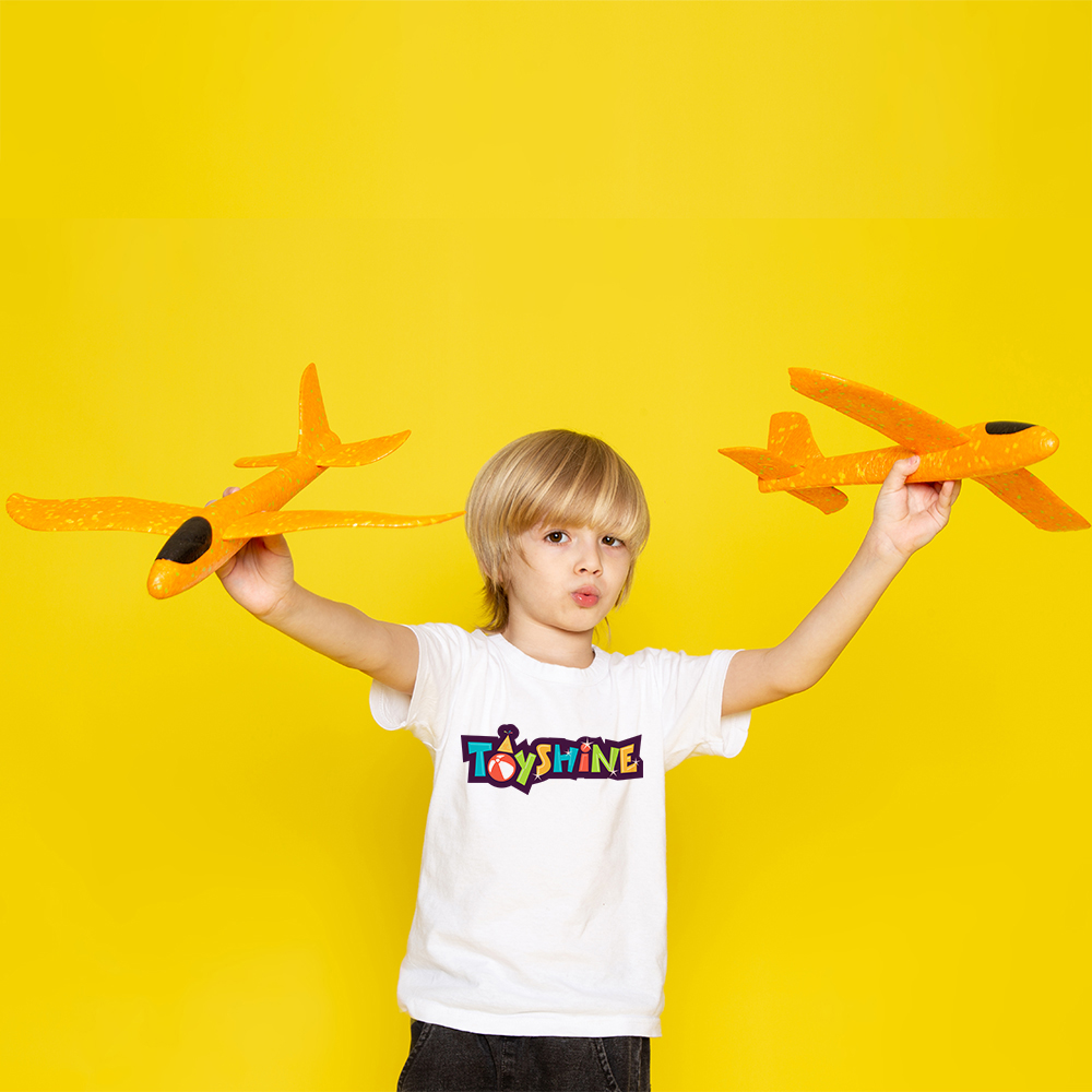
The sticker-like construction of the logo makes it easy to apply beyond print. On apparel it reads clearly at a small size and carries the brand’s energy onto the people who wear it.
A joyful, flexible identity for a toy brand: a memorable wordmark, a distinctive anchor colour and a pattern system that together make Toyshine recognisable across stationery, apparel and everyday brand materials. Read more about building a full system around a logo in Logo vs Brand Identity.
Whether you're launching something new or redefining an existing business, we'd love to hear your story.
Start Your Project →