
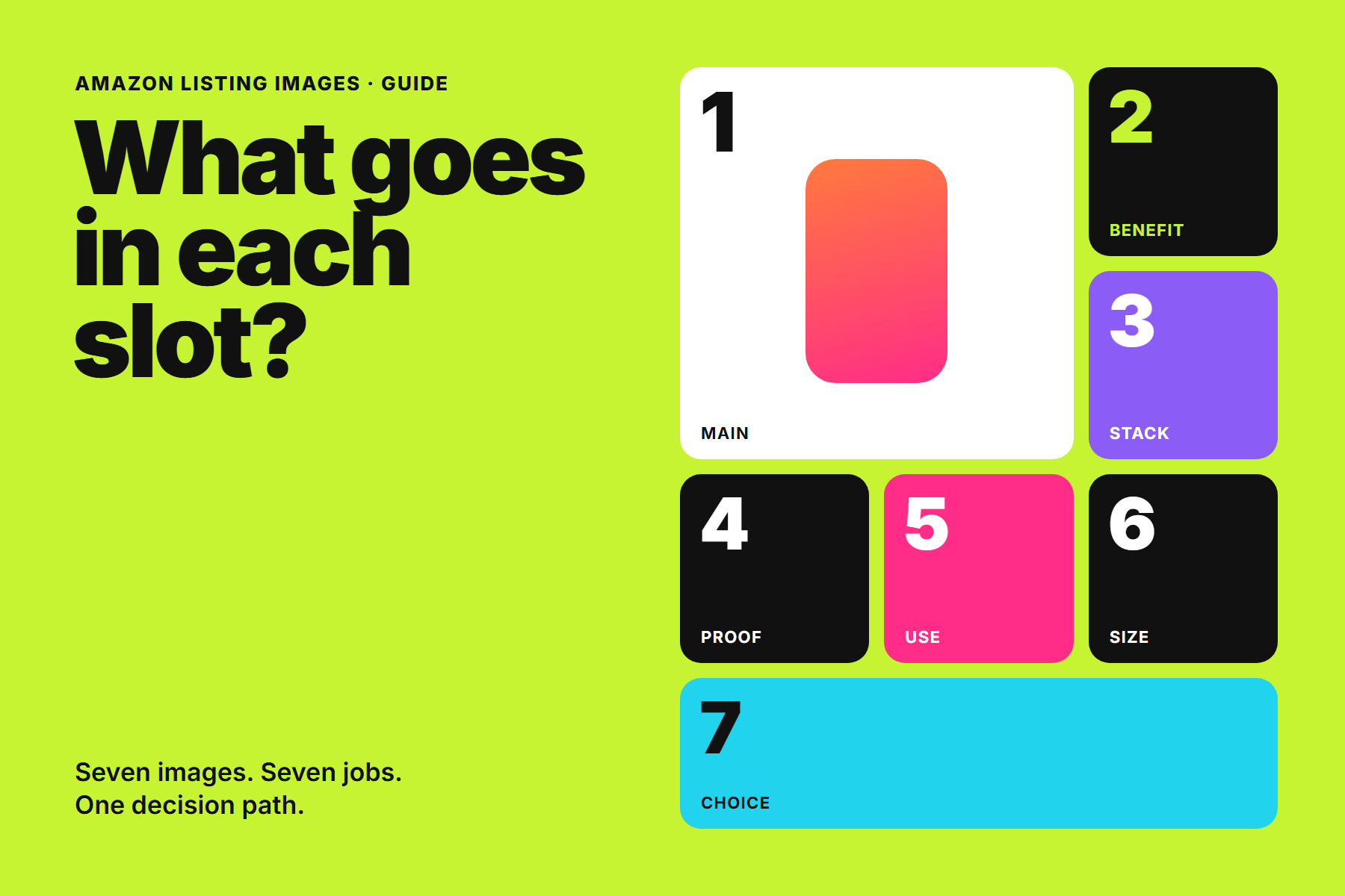
Most shoppers decide whether to keep reading a product page within a few seconds, and most of those seconds are spent on images. They swipe through the gallery, glance at a few frames and form an opinion about the product, the price and the brand before they reach the bullet points.
That makes the order of your images almost as important as the images themselves. A gallery built as seven unrelated posters forces the shopper to assemble the story on their own. A gallery planned as a sequence does that work for them: each image answers one question and leads naturally to the next.
Plan the gallery before you design a single image. The sequence is the strategy; the artwork is the execution.
This guide walks through a practical slot-by-slot plan. It builds on our earlier article on why Amazon listing images and A+ Content matter, and focuses on what to actually put in each frame.
Start with the main image rules
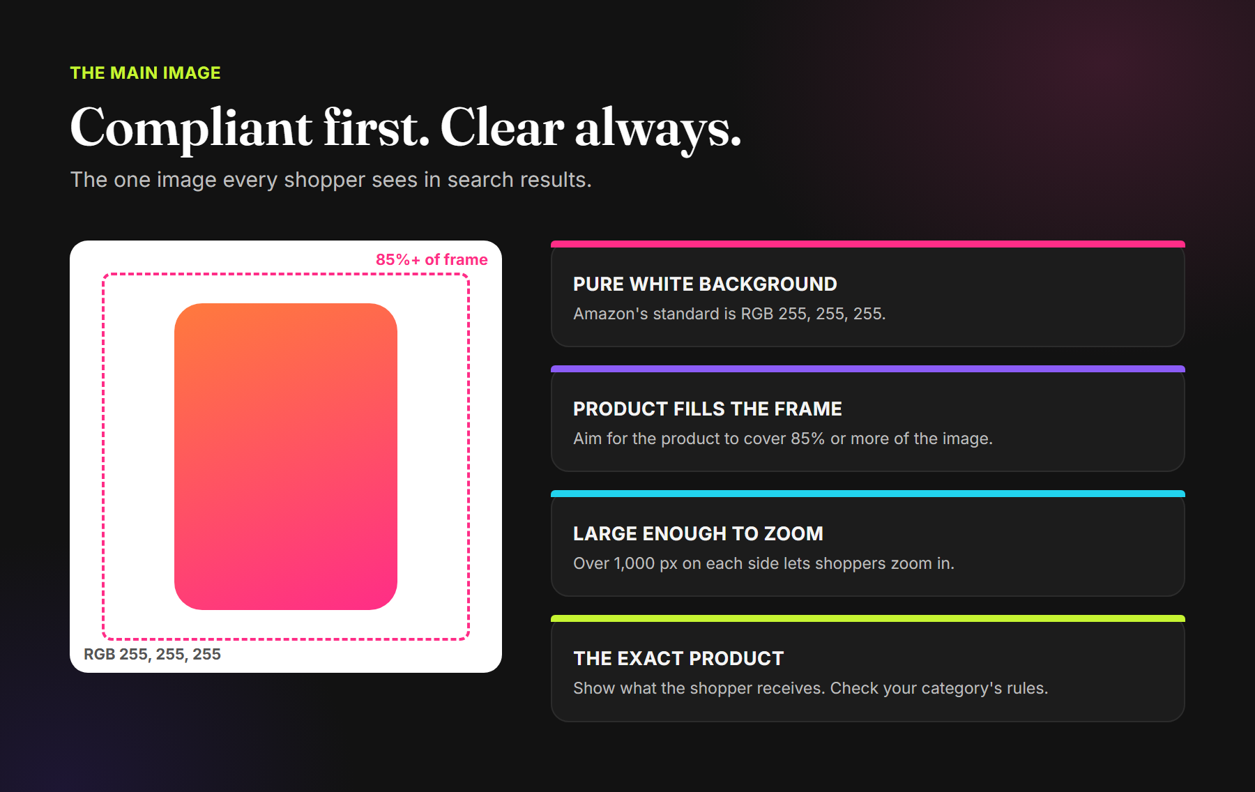
The main image is the only image most shoppers see in search results, so it carries more weight than any other frame. It is also the most tightly controlled. Amazon's own product photo guidance sets out the core standards:
- Pure white background: Amazon's standard for the main image is RGB 255, 255, 255.
- The product fills the frame: the product should occupy 85% or more of the image.
- Large enough to zoom: images larger than 1,000 pixels on each side allow shoppers to zoom in. Amazon accepts images between 500 and 10,000 pixels on the longest side.
- Sharp and accurate: images should be clear, unpixellated and without jagged edges. JPEG is the preferred format.
Category style guides add their own rules about what may appear on the main image, such as added text, graphics or items that are not included with the purchase. Always check the current style guide for your category in Seller Central before you finalise the main image.
Within those rules there is still a lot of craft. Choose the angle that makes the product most recognisable, light it so the material reads correctly, and make sure the pack in the photo matches the pack the customer will receive. If you sell several variants, keep the main images consistent in angle, scale and lighting so the range looks like one brand in search results.
A slot-by-slot plan for the rest of the gallery
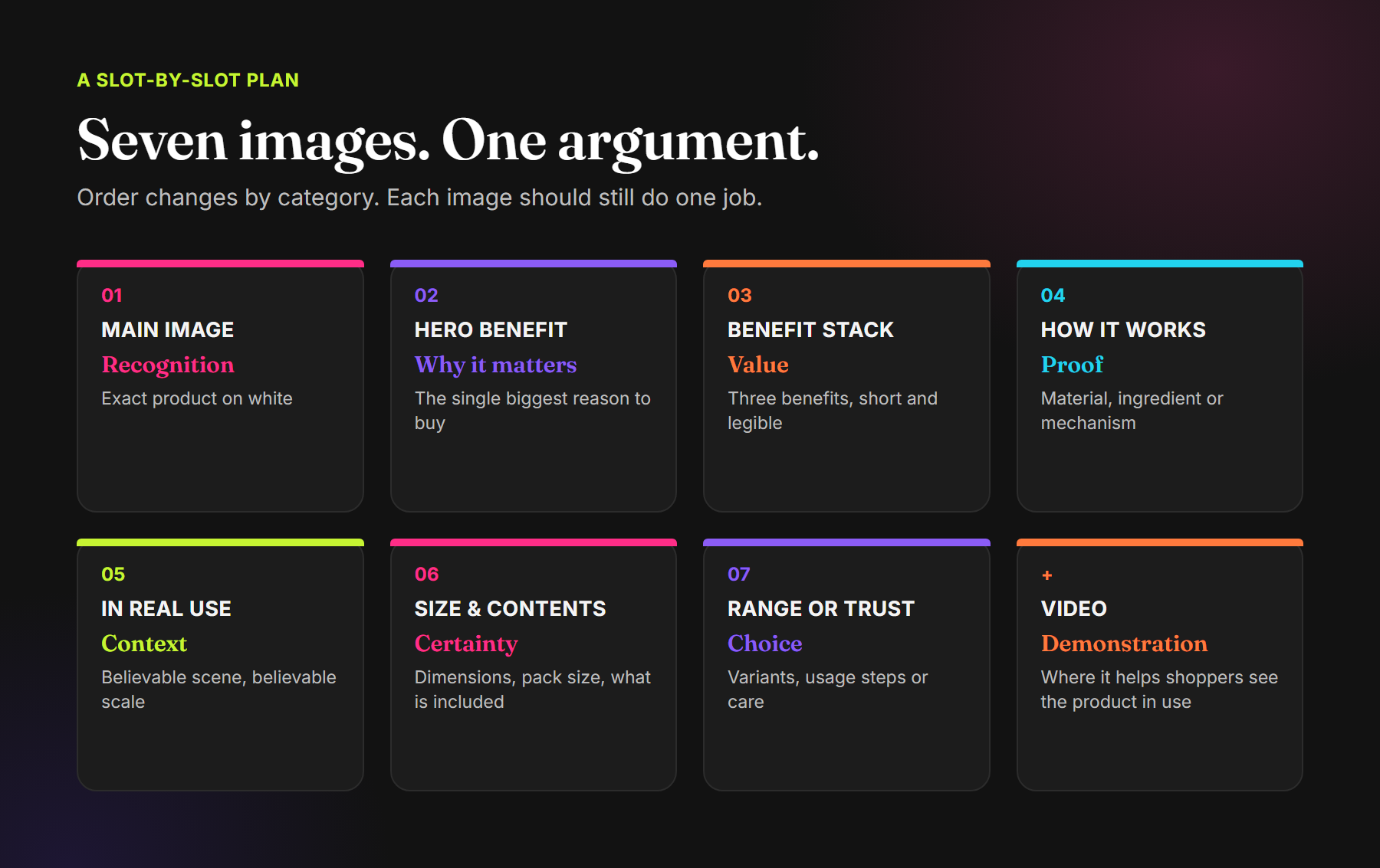
Amazon recommends at least six images for every product. The exact order should follow the questions your customers actually ask, which you can find in reviews, customer questions and returns. As a starting point, this sequence works for most physical products:
- Main image: recognition. The exact product, cleanly presented on white.
- Hero benefit: why it matters. The single biggest reason to buy, stated in one short headline with the product large in frame.
- Benefit stack: value. Two or three supporting benefits, each with a short label and a simple visual cue.
- How it works: proof. The material, ingredient, mechanism or construction behind your main claim.
- In real use: context. A believable scene that shows who uses the product, where and at what scale.
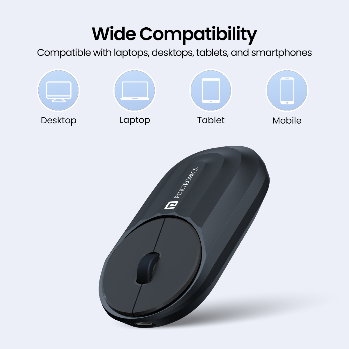
- Size and contents: certainty. Dimensions, capacity, pack size, compatibility and exactly what is in the box.
- Range or trust: choice. Variants, usage steps, care instructions or the final objection shoppers raise.
Where it helps, add a product video. A short demonstration of the product being used can answer questions that still images cannot, especially for anything with moving parts, a texture, or a set-up process.
How to design an infographic image that gets read
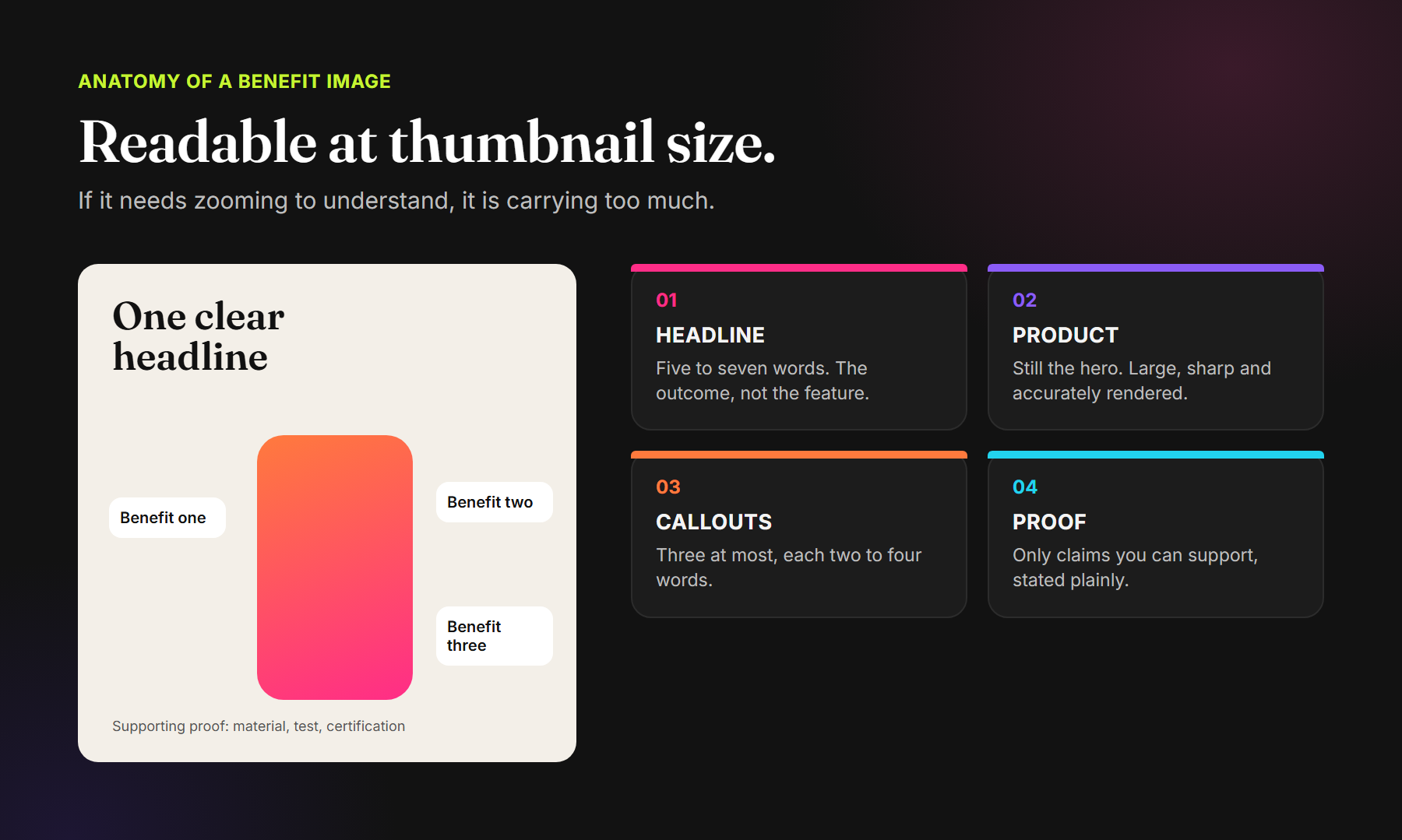
Slots two to four are usually infographics: the product plus a headline and a few callouts. These are the images most often overloaded. A good test is to view the image at the size it appears on a phone gallery. If you need to zoom to understand it, it is carrying too much.
One headline, written as an outcome
Keep the headline to five to seven words and write it as what the customer gets, not what the product has. “Stays crisp for weeks” is more useful than “Nitrogen-flushed pouch”. The feature can appear as the proof underneath.
The product stays the hero
Text and icons should support the product, not bury it. Keep the product large, sharp and accurately rendered. A shopper should recognise it from the thumbnail even before reading a word.
Three callouts at most
Two to four words each, placed close to the part of the product they describe. More than three callouts usually means the image is trying to do the job of two images.
Only claims you can support
Every claim should be accurate and, where relevant, backed by a test, certification or specification. Overclaiming may win a click, but it damages trust and can create compliance problems.
Lifestyle images: believable beats beautiful
Lifestyle images are where many galleries lose their way. A beautiful but generic scene does not help a shopper decide. A believable scene does: the product being used by the kind of person who buys it, in the setting where they would use it, at a scale that matches reality.
- Show the product in use, not just placed near people.
- Keep the scale honest. If the product is small, show it in a hand.
- Match the setting to your real customer, including the Indian home, office or kitchen if that is where the product lives.
- Keep the product clearly visible; it should not become a prop in its own photo.
Size, contents and the questions that cause returns
The size and contents image is rarely the most exciting frame, but it is often the most valuable. Many negative reviews and returns come from a mismatch between what the shopper expected and what arrived: the bottle was smaller, the cable was shorter, the pack held fewer pieces.
Show dimensions against a familiar reference, list what is included, and state capacity or quantity plainly. For food and personal care, show the pack size clearly and make sure it matches the listing's net quantity. Setting accurate expectations is one of the simplest ways to protect your rating.
Keep the gallery consistent as one system
Individually strong images can still look disjointed as a set. Before you publish, lay all the images out in order and check them together:
- The same typefaces, colour palette and icon style throughout.
- Headlines in the same position and hierarchy in every infographic.
- Consistent product angles and lighting where the product repeats.
- A clear visual link to your A+ Content and packaging, so the brand feels continuous from the gallery to the box.
For a range of products, build a template system rather than designing each listing from scratch. It keeps the brand recognisable and makes new listings faster to produce.
Common mistakes in Amazon listing images
- Repeating the main image: Two or three frames show the same product angle with little new information.
- Text too small for a phone: Copy that reads well on a desktop artboard disappears at gallery size.
- Every image says “premium”: Claims repeat without proof, and nothing new is learned from frame to frame.
- Generic stock-style lifestyle: The scene looks attractive but does not show real use or real scale.
- No size or contents image: Shoppers guess, and some guess wrong.
- Inconsistent styling: Each image looks like it came from a different designer.
- Ignoring the category style guide: A non-compliant main image can cause the listing to be suppressed.
Test, learn and refine
Treat your gallery as something to improve, not a one-time deliverable. Read new reviews and customer questions for recurring doubts, and add or adjust an image to answer them. For eligible brands, Amazon's Manage Your Experiments tool can test alternative main images and other content against each other, so decisions can rest on results rather than opinions.
Frequently asked questions
How many images should an Amazon listing have?
Amazon recommends at least six images. Use enough to cover recognition, benefits, proof, use, size and choice without repeating yourself, and check your category's limits in Seller Central.
What size should Amazon product images be?
Amazon accepts images from 500 to 10,000 pixels on the longest side and prefers images larger than 1,000 pixels on each side so shoppers can zoom. JPEG is the preferred format.
Can I put text or a logo on the main image?
Main image rules are strict and vary by category. In most categories the main image should show only the product on a pure white background. Check the current style guide for your category before adding anything else.
Should secondary images use a white background too?
No. Secondary images can use colour, scenes and graphics. They should still feel consistent with each other and with your brand.
Is a product video worth adding?
Often, yes, especially for products with a set-up process, moving parts or a texture that is hard to show in stills. Keep it short and focused on real use.
Plan the gallery. Then design it.
Amazon Listing Images · Premium A+ Content · Brand Store · Marketplace Creative
See how we've planned galleries for Gongloo, Portronics, Aeion and the Aakriti Monk Chair, or explore our Commerce Growth services.
Comments