
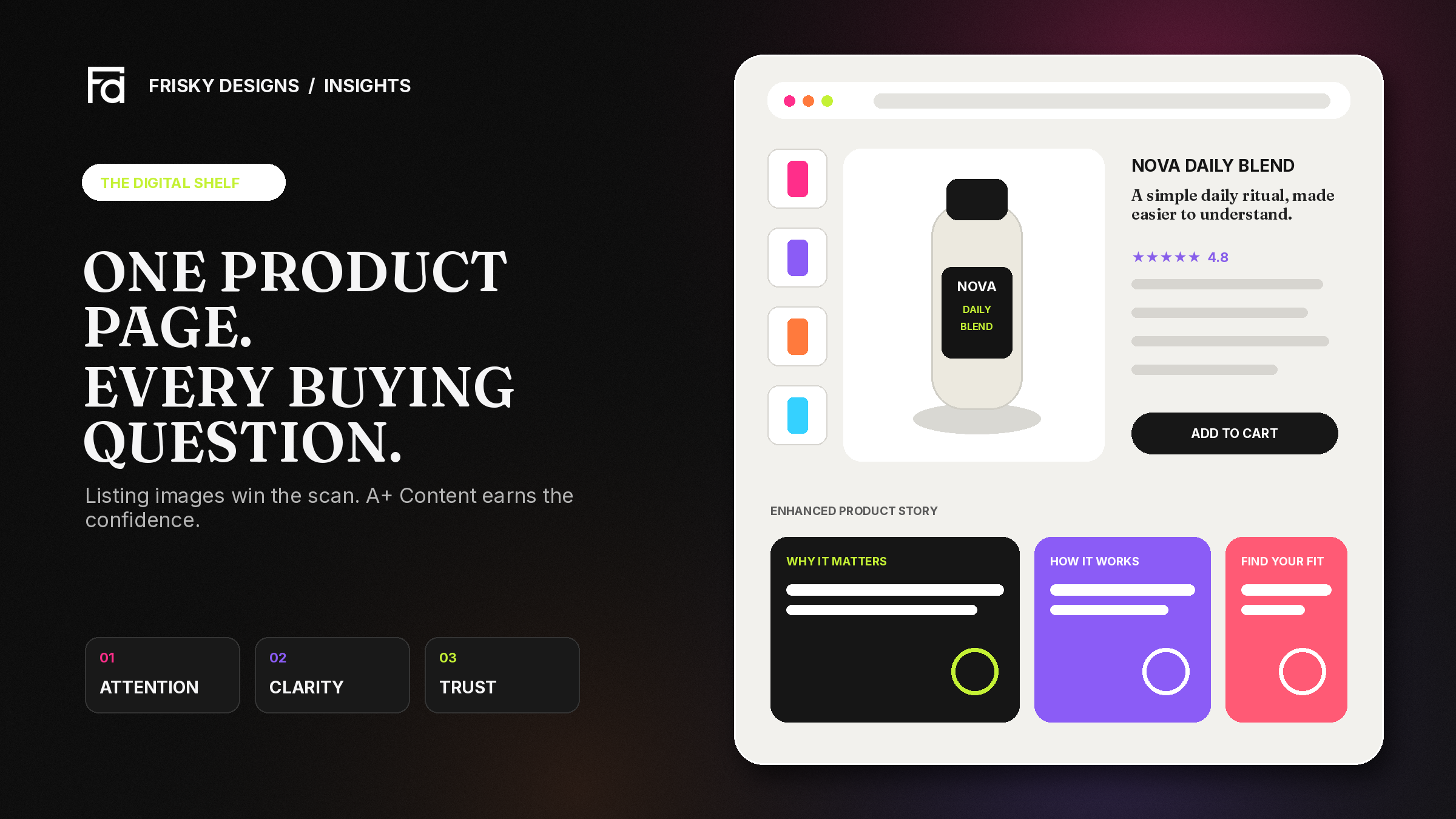
On Amazon, your product has seconds to earn attention—and one product detail page to turn that attention into confidence. Shoppers cannot pick up the pack, feel the material or ask a salesperson a quick question. Your listing has to do all of that work on a screen.
That is why Amazon listing images and A+ Content should not be treated as decoration. Together, they form a visual sales system: one attracts and explains quickly; the other builds depth, trust and differentiation. When the system is clear, shoppers understand the product faster and feel safer choosing it. When it is confusing, even a genuinely good product can look generic, risky or overpriced.
A strong Amazon product page does not simply look premium. It makes the product easier to choose.
Your product detail page is the digital shelf
In a physical store, packaging, shelf position, product demonstrations and staff all influence a decision. On Amazon, most of that responsibility is compressed into the product detail page. The title and bullet points provide searchable information, but images are often the fastest part of the page to process. A+ Content then gives interested shoppers more room to understand the product and the brand behind it.
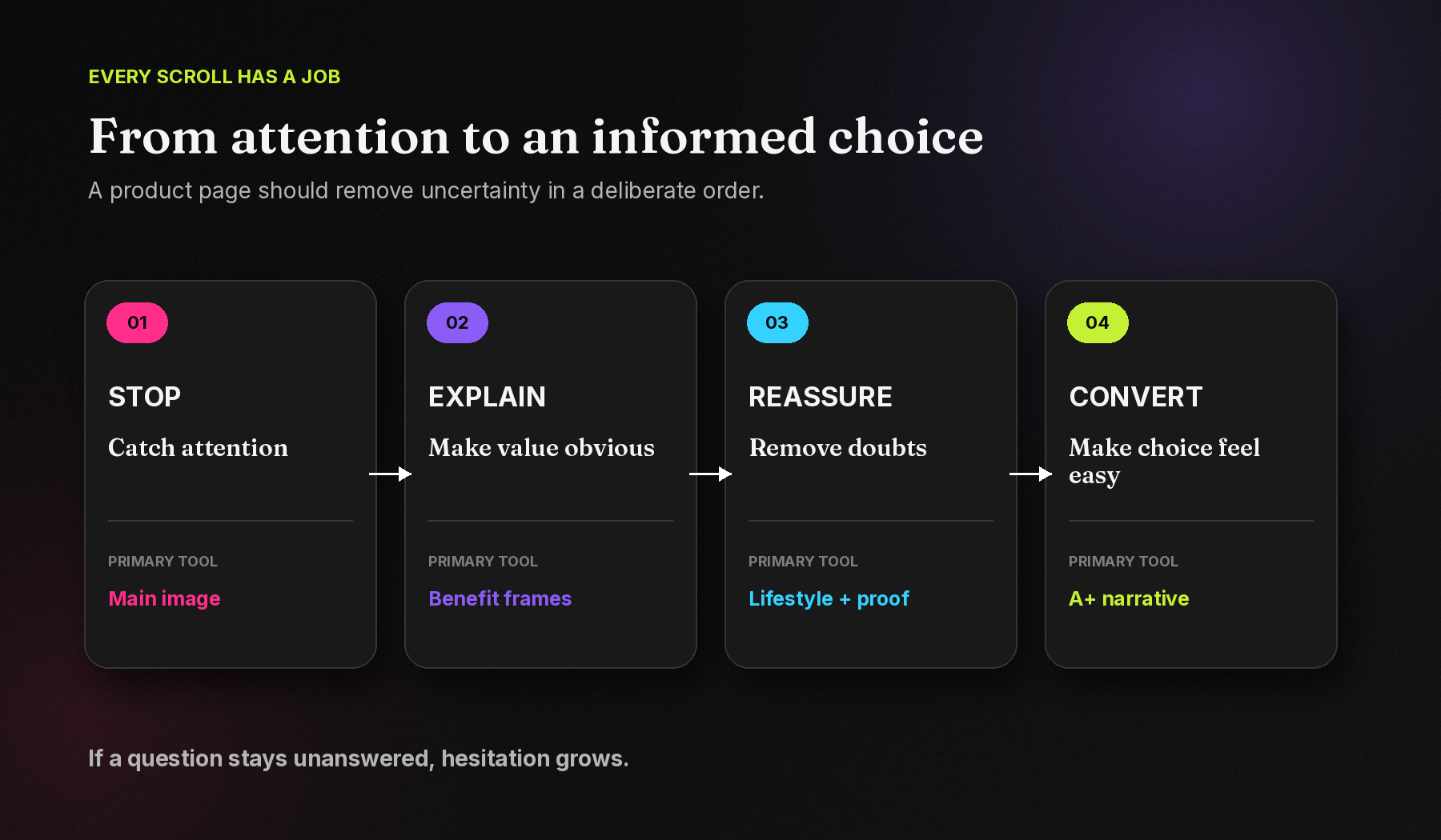
A successful page usually helps a shopper answer four questions in sequence:
- Is this relevant to what I need?
- What makes it useful or different?
- Can I trust the product and the brand?
- Is this the right option for me?
If one of those questions remains unanswered, hesitation grows. The shopper may return to search results, compare a competitor or postpone the purchase. Good design keeps the decision moving.
Why Amazon listing images matter
Listing images sit close to the buying controls and are designed for quick scanning. Their job is not to squeeze every product fact into seven squares. Their job is to make the most important information instantly understandable.
They create the first expectation
The main image should show the exact product cleanly and accurately. It establishes what is included, how the pack looks and whether the presentation feels credible. A polished main image can earn the next glance; an unclear or inconsistent one creates doubt before the shopper reads a word.
They turn features into reasons to buy
A feature is only useful when the customer understands its benefit. “Double-layer construction” is information. “Keeps the exterior comfortable to hold” explains why that information matters. Strong listing design connects the product fact to a real customer outcome without making unsupported claims.
They answer objections before they become exits
Dimensions, compatibility, ingredients, materials, usage steps, what is included and care instructions are not secondary details. They are often the questions standing between interest and purchase. Visualising them clearly can reduce uncertainty and help set accurate expectations.
They make an unfamiliar product feel real
Lifestyle scenes, scale references, close-ups and in-use demonstrations give context that a plain product cut-out cannot. The best lifestyle image is not generic mood photography; it shows the product being used in a believable situation and at a believable scale.
Amazon describes product photos as capable of making or breaking a sale. Its current guidance recommends at least six images, although sellers can upload up to nine, and favours images larger than 1,000 pixels on each side to support zoom. Requirements can differ by category, so the current rules should always be checked before publishing.
A strong image sequence works like a sales conversation
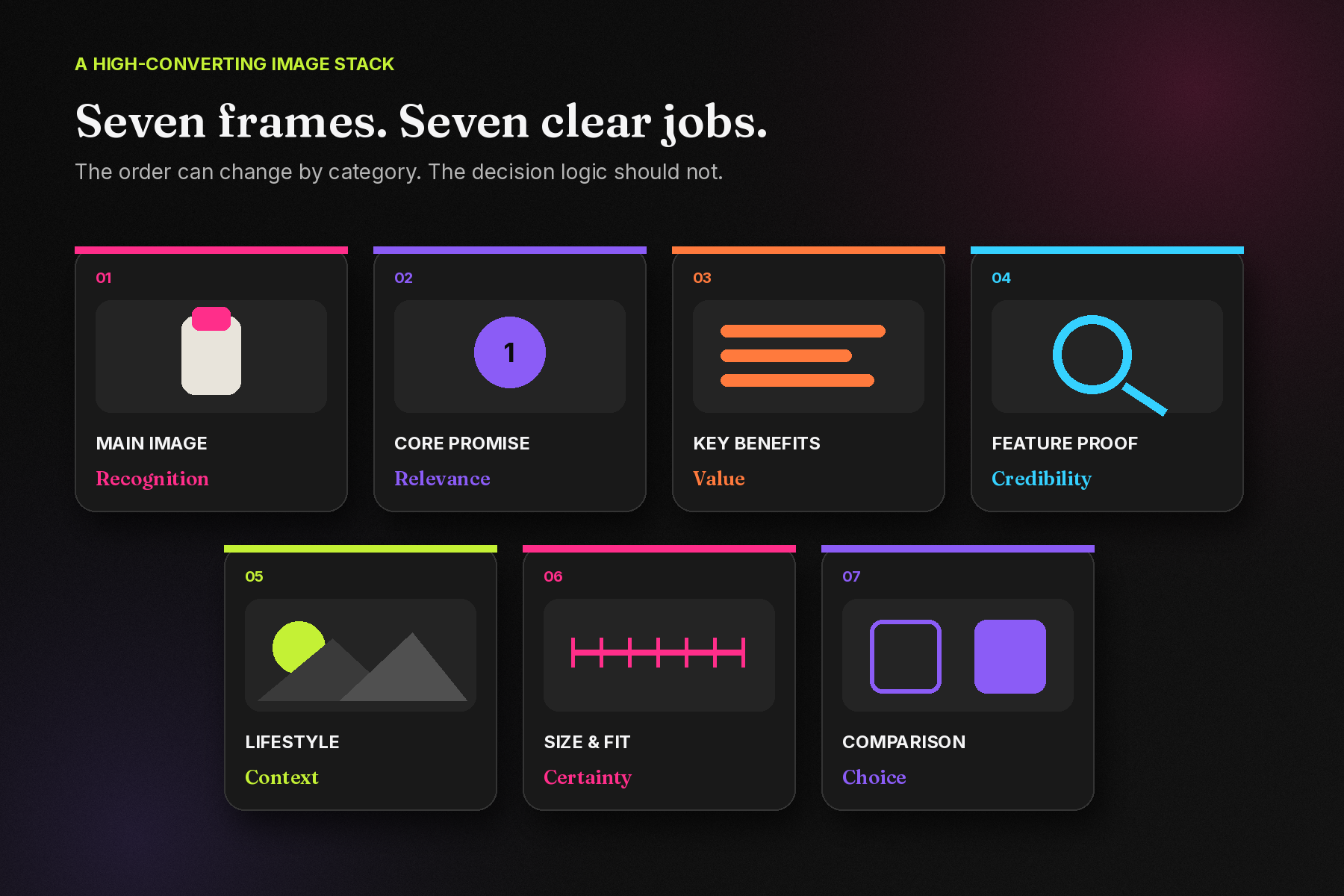
One isolated image may look attractive. A sequence creates understanding. Although the exact order should change with the category and the questions customers ask, a practical structure is:
- Main image: Show the exact product clearly and compliantly.
- Core promise: Communicate the single most important benefit.
- Key benefits: Explain two or three reasons the product is useful.
- Feature proof: Show the material, mechanism, ingredient or construction behind the claim.
- Lifestyle context: Demonstrate where, when or by whom the product is used.
- Size and fit: Clarify dimensions, capacity, compatibility or pack contents.
- Choice support: Compare variants, show the range or resolve the final objection.
The principle is simple: each frame should have one primary job. When every image tries to say everything, the gallery becomes a brochure reduced to thumbnail size—and shoppers have to work too hard to understand it.
For a detailed breakdown of what to put in each frame, read our slot-by-slot guide to Amazon listing images.
What A+ Content adds
A+ Content begins where the image gallery runs out of room. It is not simply a longer product description, and it should not repeat the same headlines and images from above. It should move the story forward.
Amazon offers Basic A+ Content, Premium A+ Content and Brand Story formats. Depending on eligibility and module type, brands can use enhanced imagery, custom text layouts, comparison charts, larger visuals, video, carousels, hotspots and other interactive elements. This creates space to:
- Explain complex value: Break a mechanism, process or ingredient story into simple visual steps.
- Build brand recognition: Use a consistent visual language across the product range.
- Support premium positioning: Show the craft, detail or thinking that justifies the price.
- Help shoppers compare: Clarify which variant or related product best fits their need.
- Create a connected catalogue: Introduce complementary products without losing the main product story.
Amazon reports that Basic A+ Content can increase sales by up to 8%, while well-implemented Premium A+ Content can increase sales by up to 20%, based on Amazon internal data. Those figures are not a guarantee. The value comes from implementation: clear strategy, accurate claims, useful information, strong creative and a product shoppers genuinely want.
Listing images and A+ Content do different jobs
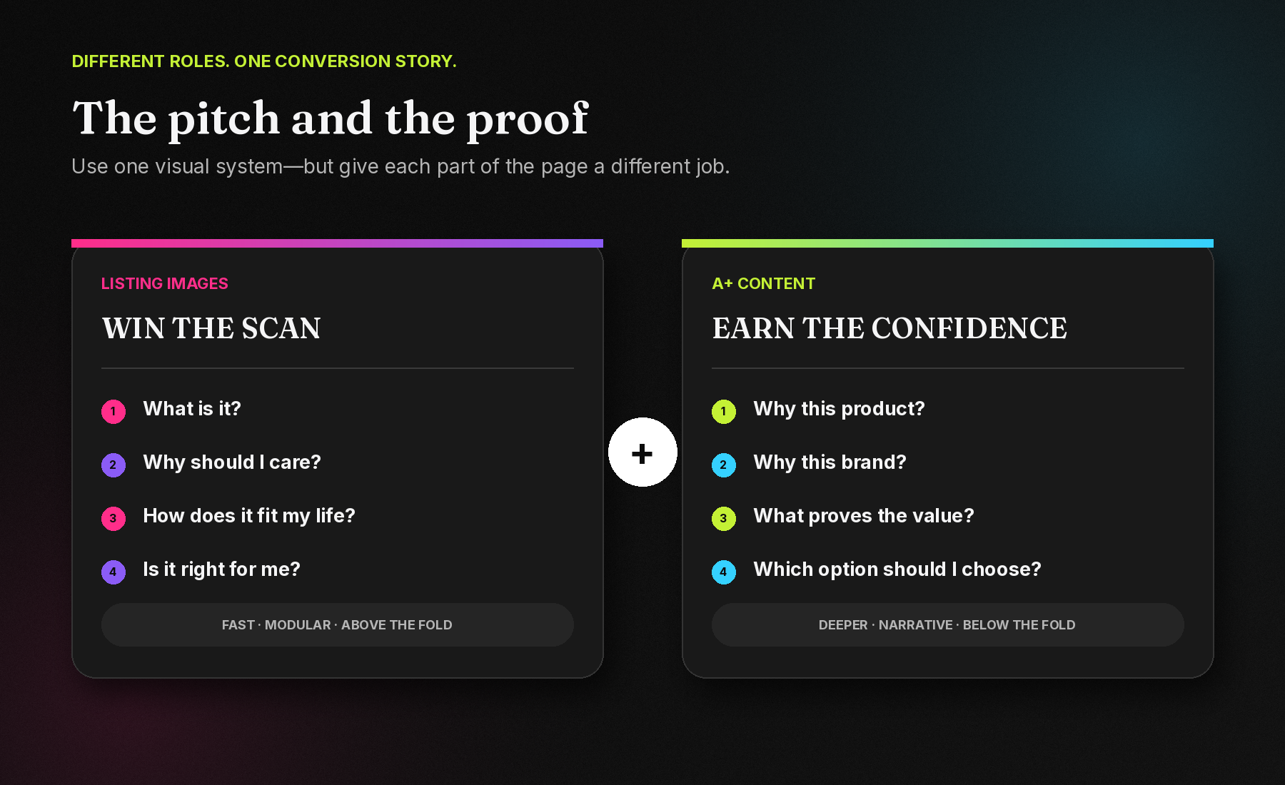
The image gallery sits near the top of the product page and must communicate quickly. A+ Content appears farther down and serves the shopper who wants more evidence before buying. The two should feel like one visual system, but they should not behave like duplicates.
Listing images are best for: immediate recognition, the main benefit, fast feature scanning, size and fit, use cases and the most common objections.
A+ Content is best for: deeper explanation, brand story, process, detailed proof, range comparison and a more immersive visual narrative.
Think of the gallery as the pitch and A+ Content as the proof. The first earns attention. The second rewards attention with confidence.
Why design quality affects trust
Customers cannot inspect your internal quality controls, but they can see how carefully you present the product. Consistent typography, accurate renders, controlled colour, clear hierarchy and considered spacing signal that details matter. Poor cropping, inconsistent packs, tiny text or conflicting styles can make a premium product feel improvised.
That does not mean every listing should be loud. In fact, many of the most effective pages are visually restrained. They create impact through focus: one message at a time, strong product presence and enough space for the eye to understand the hierarchy.
Clarity converts before creativity does. The creative idea should make the value clearer—not compete with it.
Design for the phone, not just the artboard
A composition may look impressive at full size and fail completely on a mobile screen. Text becomes too small, supporting icons merge into noise and the product loses presence. Mobile-first design requires ruthless prioritisation.
- Keep one dominant message in each image or module.
- Use short headlines that remain legible at thumbnail size.
- Create strong contrast between text, product and background.
- Protect important content from module crops and screen edges.
- Check that the product remains recognisable without zooming.
- Preview A+ modules in their stacked mobile order, not only as a desktop layout.
Design on a large screen if needed, but judge the work at the size customers will actually see it.
Common mistakes that weaken an Amazon page
- Treating every image as a separate poster: The gallery lacks a logical narrative and visual consistency.
- Using decoration instead of communication: Effects, badges and props overpower the product or the message.
- Repeating the same claim: Multiple frames say “premium quality” without adding evidence or new information.
- Showing generic lifestyle scenes: The setting looks aspirational but does not demonstrate the real use, scale or audience.
- Ignoring expectations: Dimensions, contents, compatibility or packaging are unclear, increasing the chance of disappointment.
- Copying the gallery into A+: The shopper scrolls farther but learns nothing new.
- Designing variants without a system: Different sizes, colours or flavours look like unrelated brands.
- Overclaiming: Unsupported superlatives or inaccurate product visuals may damage trust and create compliance problems.
Design, test, learn and improve
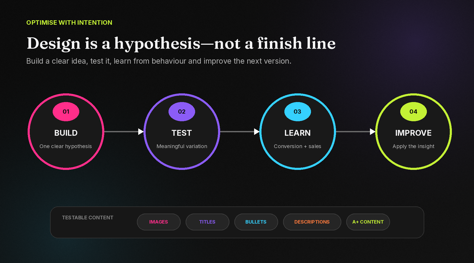
Good creative begins with a hypothesis. For example: will a benefit-led second image communicate faster than a technical feature-led version? Will a scale visual resolve more uncertainty than another lifestyle shot? Will a simpler A+ opening make the core promise easier to understand?
For eligible brands, Amazon Manage Your Experiments can test versions of product images, titles, bullet points, descriptions and A+ Content, including Brand Story. Amazon reports results using measures such as conversion rate, units sold and sales, and recommends letting experiments run to completion so early fluctuations do not become false conclusions.
Testing should not be random redesign. Change a meaningful idea, define what you expect to improve and learn from the result. The goal is not simply to choose the prettier version; it is to understand which communication helps customers decide.
When should a brand invest in professional Amazon creative?
Professional listing and A+ design becomes especially valuable when:
- Advertising is bringing traffic, but the product page is not converting strongly.
- The category is crowded and competitors appear interchangeable.
- The product is new, technical or difficult to understand quickly.
- The price is premium and the page does not yet justify that premium.
- There are multiple sizes, colours, flavours or related products to organise.
- Customer questions or returns reveal a gap between expectation and reality.
- The brand looks polished everywhere else but inconsistent on Amazon.
Not every product needs cinematic imagery. Every product does need a clear decision path.
Make every scroll earn the next one
Amazon is a comparison environment. Shoppers can leave your page in a tap, so every image and module has to earn its place. Listing images should make the product immediately understandable. A+ Content should deepen that understanding, establish the brand and resolve the questions that remain.
When both are planned as one system, the page feels clearer, more credible and more valuable. It does not pressure the shopper. It removes the reasons to hesitate.
Frequently asked questions
Are Amazon listing images and A+ Content the same?
No. Listing images appear in the main product gallery and support fast evaluation near the top of the page. A+ Content appears farther down and gives eligible sellers more space for enhanced visuals, deeper product information, comparisons and brand storytelling.
How many Amazon listing images should a product have?
Amazon currently recommends at least six product images and allows sellers to upload up to nine. The ideal sequence depends on the product and category, and category-specific image rules should always be checked before upload.
Does A+ Content improve Amazon search ranking?
A+ Content should not replace keyword research, accurate titles, bullet points or backend search terms. Its primary role is to improve product understanding and conversion. Stronger conversion can support overall listing performance, but no creative element guarantees a ranking increase.
What is the difference between Basic and Premium A+ Content?
Basic A+ supports enhanced images, text layouts and comparison modules. Premium A+ can add larger visual formats and richer elements such as video, carousels, Q&A sections and interactive hotspots, subject to Amazon eligibility and current feature availability.
Can website or social media creatives be reused on Amazon?
The underlying photography and brand assets may be reused, but the communication should be adapted. Amazon shoppers are comparing options and scanning on mobile, so the content needs marketplace-specific hierarchy, product accuracy, legibility and compliance.
Build an Amazon page that earns the click—and the confidence.
Amazon Listing Images · Premium A+ Content · Brand Store · Marketplace Creative
See how we've applied this for Gongloo, Portronics, Aeion, the Aakriti Monk Chair and Decor A+ Content, or explore our Commerce Growth services.
Comments