
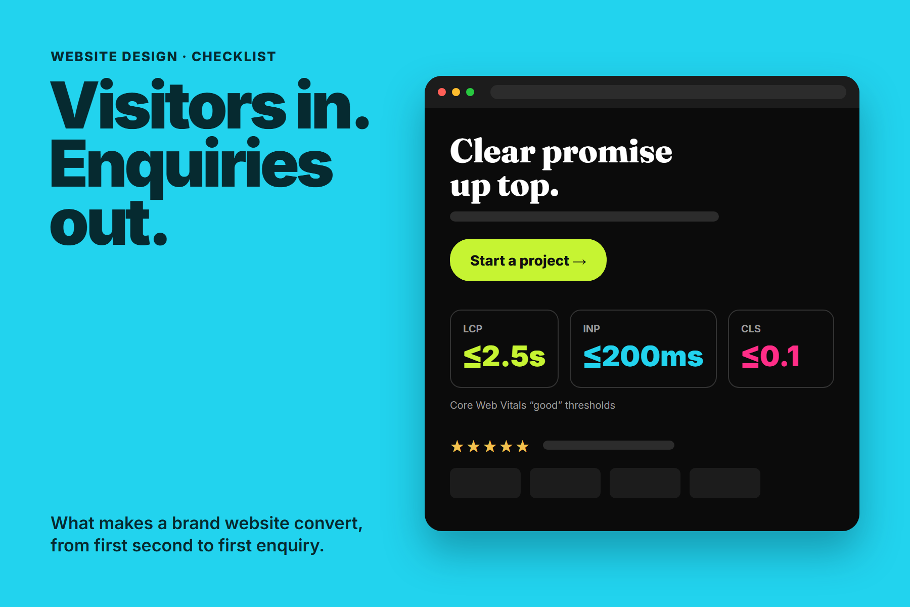
Most visitors decide within moments whether a website is worth their time. They are not reading every word; they are scanning for signals. Is this relevant to me? Is it any good? Can I trust these people? What do I do next?
A website converts when it answers those questions in order, quickly, and on a phone. This checklist covers the design and content decisions that make the biggest difference for growing brands.
Visitors don't read websites; they scan them for reasons to stay. Give them those reasons in the first screen.
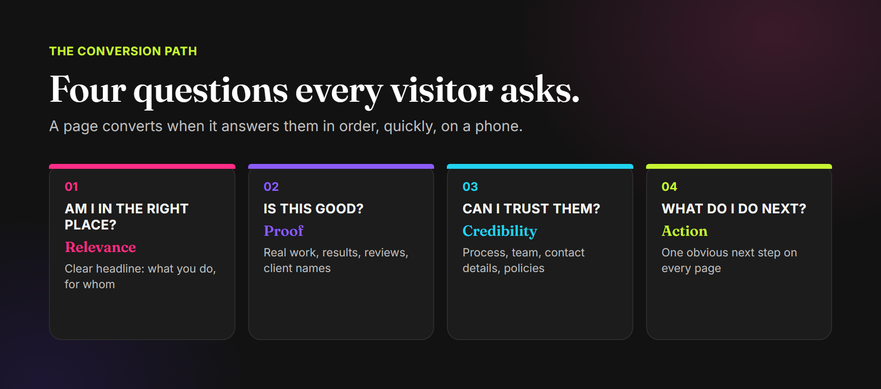
The four questions every visitor asks
- Am I in the right place? A clear headline that says what you do and for whom.
- Is this good? Real work, results, reviews and recognisable client names.
- Can I trust them? Process, team, contact details and clear policies.
- What do I do next? One obvious next step on every page.
1. Say what you do in the first screen
The headline is the most important sentence on the site. Clever lines that could belong to any business make visitors work to understand you. Be specific: what you offer, who it is for and what outcome they get. Support it with one short line and a clear primary button.
2. Show proof early
Claims are easy to make; proof is what persuades. Bring your strongest evidence close to the top of the page:
- Real work, with images and short explanations of the problem and result.
- Genuine reviews, ideally linked to where they were published.
- Client names or logos, used with permission.
- Specific numbers, where you can support them.
Proof only helps if it is real. Placeholder testimonials and unsupported numbers damage trust the moment a visitor notices them.
3. Make trust easy to find
Visitors look for signs that a real, reliable business is behind the site: an about page with real people, a clear process, visible contact details, and policies for privacy, delivery or refunds where relevant. For service businesses, a short explanation of how a project works removes a lot of hesitation.
4. Give every page one clear next step
Every page should have a primary action, repeated where it makes sense: start a project, book a call, shop the range. Too many competing buttons create hesitation. Keep forms short, ask only for what you need, and confirm clearly what happens after someone submits.
Offer the contact channels your customers actually use. In India, that often means WhatsApp alongside email and phone.
5. Design for the phone first
For many brands, most visitors arrive on a phone. A layout that works on a large screen can fail on a small one: text becomes tiny, buttons crowd together and important content ends up far below the fold.
- Check every key page on a real phone, not only in a desktop browser.
- Keep tap targets large enough to use comfortably.
- Make sure floating buttons, chat widgets and banners do not cover content.
- Keep the primary action visible without excessive scrolling.
6. Make it fast
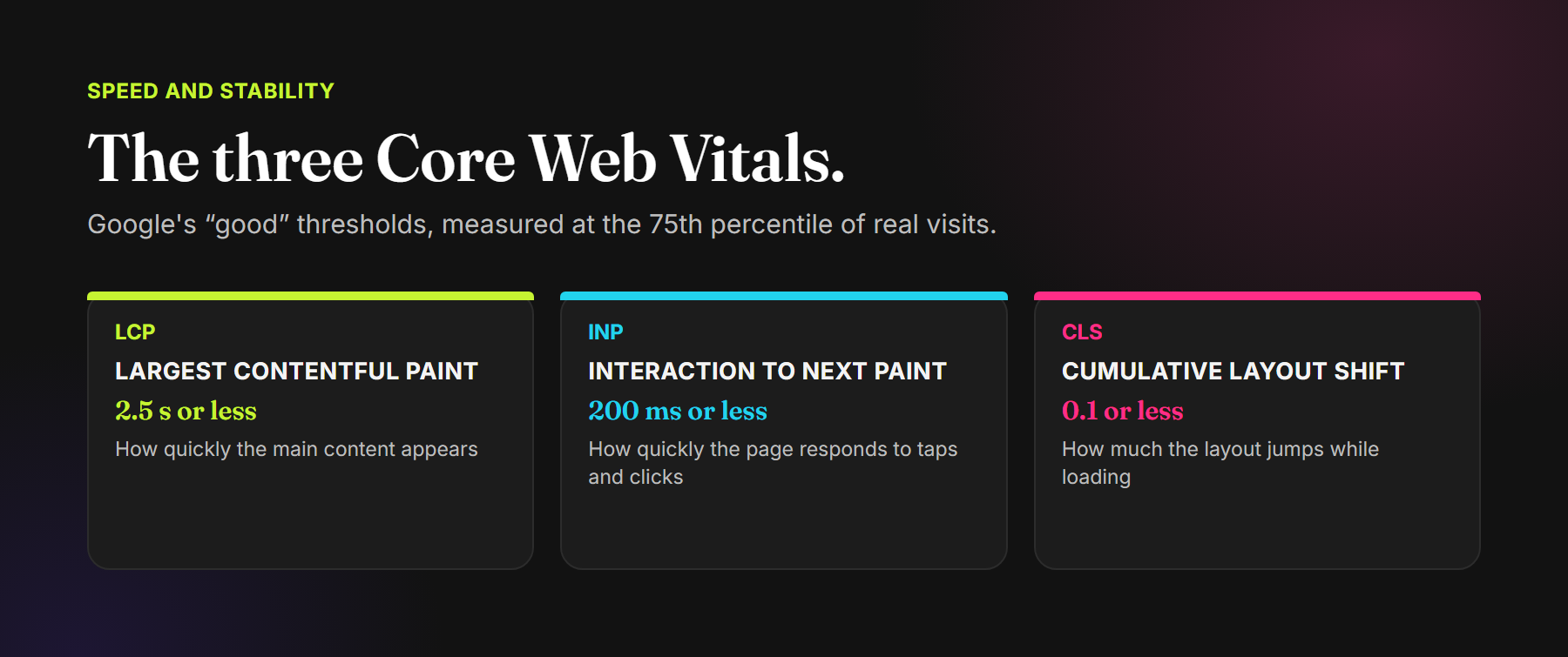
Speed affects both experience and search visibility. Google's Core Web Vitals measure three aspects of real-world performance. The “good” thresholds, assessed at the 75th percentile of page loads, are:
- Largest Contentful Paint (LCP): 2.5 seconds or less, for how quickly the main content appears.
- Interaction to Next Paint (INP): 200 milliseconds or less, for how quickly the page responds to taps and clicks.
- Cumulative Layout Shift (CLS): 0.1 or less, for how much the layout jumps while loading.
The usual causes of slow pages are oversized images and video, heavy scripts and third-party widgets. Serve images at the size they are displayed, load the main image first, and question every script that is added to the page.
7. Build for search from the start
A website that converts still needs visitors. Build the basics in from the beginning: a unique title and description for every page, one clear heading per page, descriptive image alt text, a sitemap, structured data for your organisation and articles, and pages for the specific services people search for. Helpful articles that answer real customer questions give search engines, and AI search tools, more reasons to send people your way.
8. Keep the brand consistent
Your website is often where people check whether the brand they saw on social media or a marketplace is real and established. Use the same identity, tone and quality of imagery everywhere, so the website confirms the impression rather than contradicting it.

Common website mistakes
- A vague headline: visitors cannot tell what you do without scrolling.
- Proof hidden deep in the site: the best work sits three clicks away.
- Too many calls to action: nothing stands out, so nothing gets clicked.
- Heavy media: large videos and full-resolution images slow every visit.
- Desktop-only testing: the site looks great on a monitor and struggles on a phone.
- Set and forget: the site is never updated with new work, and starts to look abandoned.
Frequently asked questions
What makes a website convert?
A clear message in the first screen, visible proof, easy-to-find trust signals, one obvious next step, a fast and mobile-friendly experience, and consistent branding.
What are good Core Web Vitals scores?
Google considers LCP of 2.5 seconds or less, INP of 200 milliseconds or less and CLS of 0.1 or less to be good, measured at the 75th percentile of page loads.
How often should a brand website be updated?
Add new work, reviews and content regularly, and review the key pages whenever your offer, audience or positioning changes.
Does website design affect SEO?
Yes. Structure, speed, mobile usability, headings, internal links and helpful content all influence how search engines understand and rank a site.
A website built to be chosen, not just admired.
Website Strategy · UI Design · Responsive Development · CMS Integration · Landing Pages · Performance Optimisation
Read why websites are slow, and how we sped up our own, or see how we carry identities into digital work for Delta Cargo and ChilliClove, or explore our Digital Experiences services.
Comments