
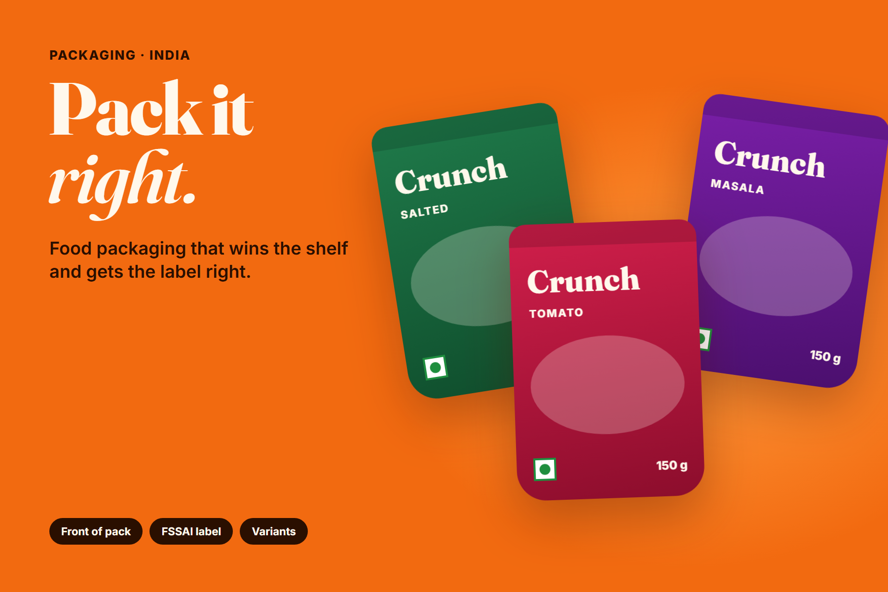
A food pack is often the first and only conversation a brand has with a customer before purchase. In a kirana store, a supermarket aisle or a quick-commerce app, the pack has to say what the product is, why it is worth choosing and whether it can be trusted, all in a few seconds.
At the same time, food packaging in India carries information that is required by law: ingredients, nutrition, date marking, the FSSAI licence number and more. Good packaging design does not treat these as separate problems. It builds a pack where the persuasive front and the informative back work as one system.
A pack that sells well but labels poorly is a liability. A pack that labels correctly but disappears on the shelf is a missed opportunity. Good design solves both.
What the front of pack has to do
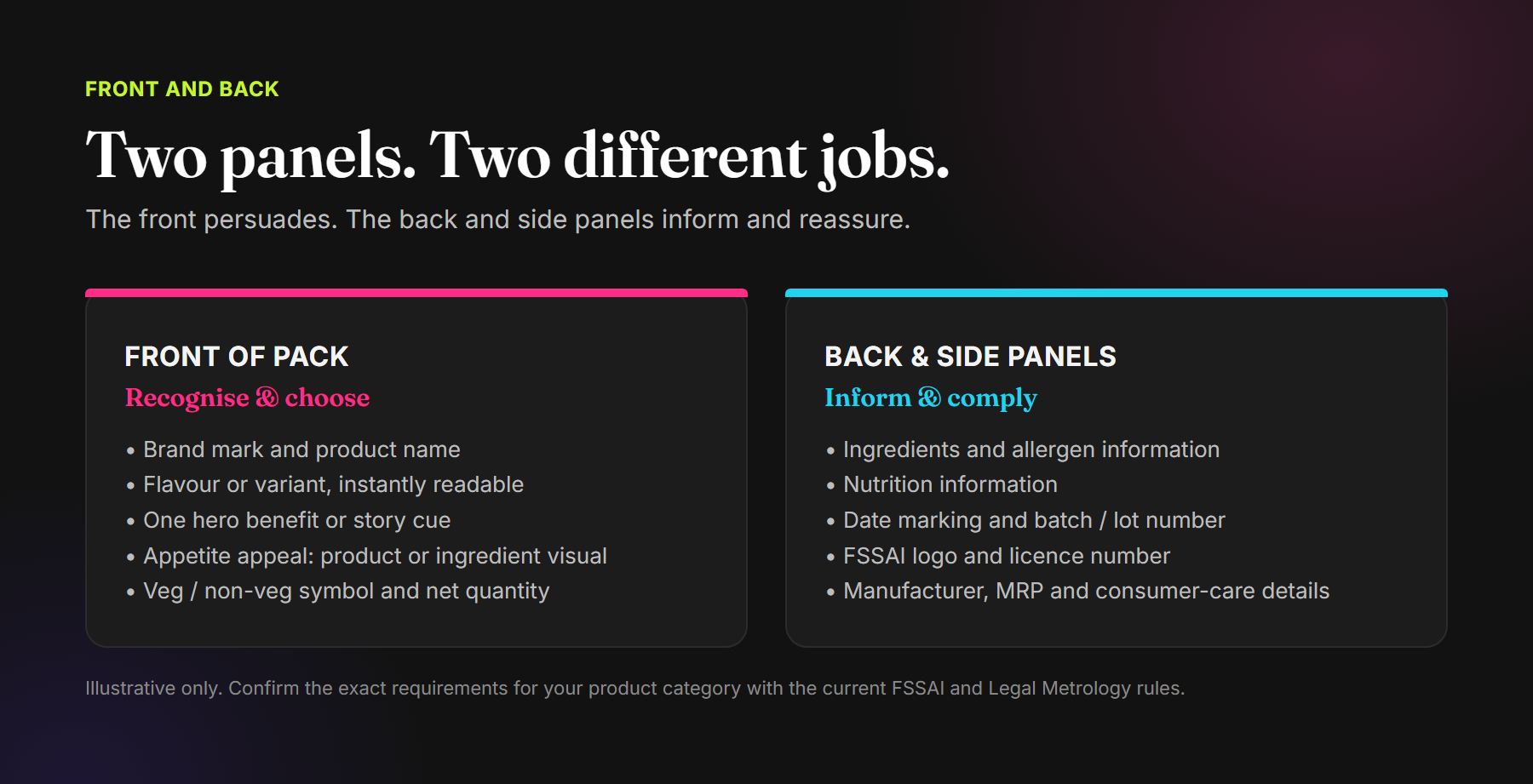
The front of pack, or principal display panel, is where the buying decision starts. In most categories it should make four things obvious at a glance:
- Who makes it: a recognisable brand mark placed consistently across the range.
- What it is: the product name, which Indian labelling rules require on the front of the pack.
- Which one it is: the flavour, variant or size, readable from a distance.
- Why it is worth choosing: one clear reason, such as a hero ingredient, a regional origin, a health cue or a taste promise.
Appetite appeal matters too. A clear visual of the product or its key ingredient helps customers imagine the taste. Whatever you show should honestly represent what is inside; serving suggestions should be presented as suggestions.
The label information your pack needs to carry
In India, the main rules for food labels come from the Food Safety and Standards (Labelling and Display) Regulations, 2020, issued by the Food Safety and Standards Authority of India (FSSAI). Net quantity, retail sale price and consumer-care details fall under the Legal Metrology (Packaged Commodities) Rules, 2011. Between them, a typical pre-packaged food label needs to include, among other things:
- The name of the food, on the front of the pack.
- The list of ingredients, including added water where relevant, and allergen information.
- Nutrition information.
- The vegetarian (green) or non-vegetarian (brown) symbol.
- Date of manufacture or packing, and the expiry or use-by date.
- The batch or lot number.
- The FSSAI logo and licence or registration number.
- The name and address of the manufacturer, packer or marketer.
- Net quantity, maximum retail price and consumer-care details.
Requirements differ by product category and are updated from time to time, including specific rules on type size and placement. Treat this list as a design checklist, not legal advice, and confirm the final label with the current regulations and, where needed, a food regulatory consultant before you print.
Design the back of pack, don't just fill it
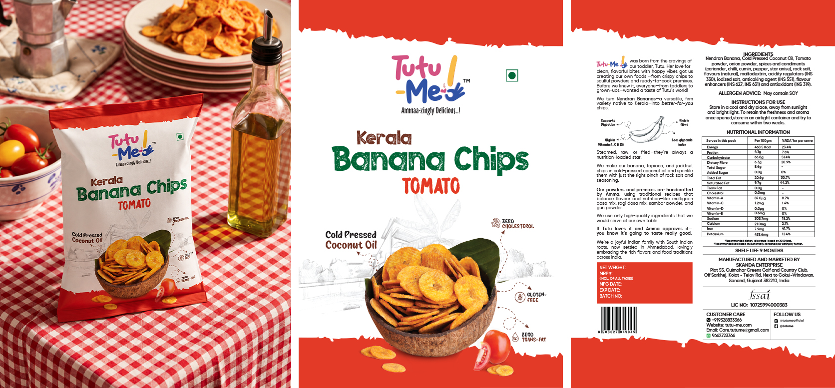
The back of pack is often left until the end and filled with whatever space remains. That is where readability problems start: tiny type, poor contrast on printed textures, and important details lost in fold lines or seals.
- Plan the back panel layout at the start, using the real label copy rather than placeholder text.
- Group related information so customers can find it: ingredients with allergens, dates with batch number.
- Choose type sizes and contrast that remain readable when printed on the actual material, not only on screen.
- Keep critical information away from seals, gussets and areas that crease or get cut.
- Use the back to build the brand as well: a short origin story, usage ideas or a recipe gives customers another reason to remember you.
Build a variant system, not a set of one-offs
Most food brands launch with more than one flavour or size, and add more over time. If every variant is designed as a separate piece of artwork, the range quickly looks inconsistent and each new launch takes longer than it should.
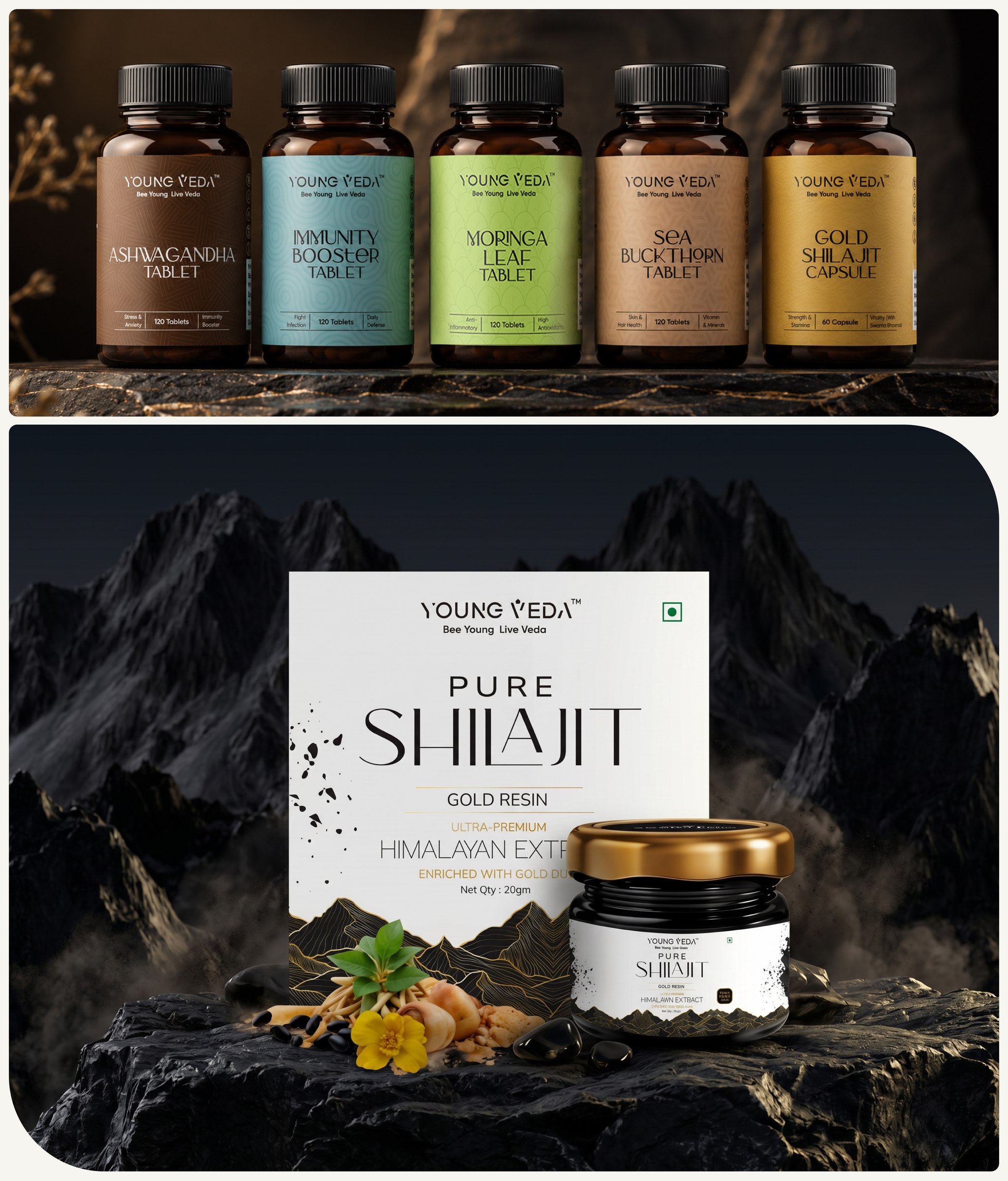
A variant system fixes the shared elements and defines exactly what changes:
- Fixed: brand mark position, layout grid, typography, back-panel structure.
- Variable: a colour code per flavour, the ingredient or product visual, the variant name.
- Rules: how a new flavour gets its colour, how sizes scale the layout, what happens on very small packs.
On a shelf, a well-coded range helps customers find their favourite quickly and makes the brand block more visible. On a quick-commerce or marketplace app, it keeps thumbnails recognisable and consistent.
Design for the shelf and the screen
Food brands increasingly sell through quick-commerce apps and marketplaces as well as physical stores. On a screen, the pack is often seen as a small thumbnail. Designs that rely on fine detail or long copy can become unreadable.
- Check the front of pack at thumbnail size. The brand, product and variant should still be clear.
- Use strong contrast between the product name and the background.
- Prepare clean digital renders of every pack for app and marketplace listings, and keep them consistent across the range.
- If you sell on Amazon, plan the pack with the listing in mind. Our guide to Amazon listing images covers how the gallery builds on the pack.
From brief to print: the packaging process
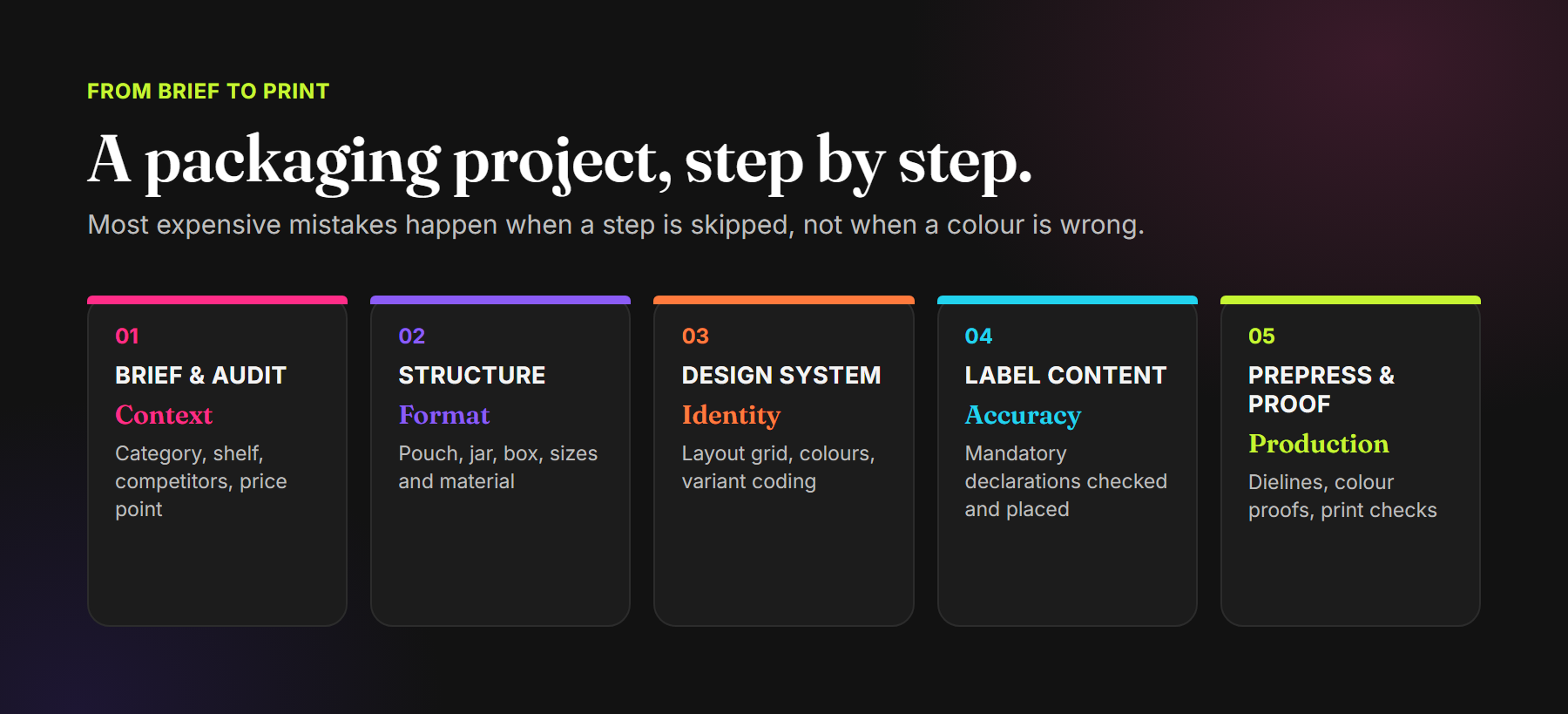
The most expensive packaging mistakes rarely come from a wrong colour. They come from skipped steps: a label change after printing plates are made, a dieline that does not match the pouch supplier, or artwork approved on screen that looks different on the material.
- Brief and audit: category, competitors, price point, where the product will be sold.
- Structure and format: pouch, jar, carton or tin; sizes; material and printing process, agreed with your supplier.
- Design system: layout grid, typography, colour coding and imagery style for the range.
- Label content: final, checked label copy placed and reviewed against the current requirements.
- Prepress and proofing: artwork built on the supplier's dieline, colour proofs checked on the actual material, final sign-off before production.
Common food packaging mistakes
- Leaving the label copy to the end: the back panel becomes crowded and hard to read.
- Too many messages on the front: five claims compete and none is remembered.
- Variants that look like different brands: no shared system, so the range never builds recognition.
- Visuals that overpromise: the image suggests something the product does not contain.
- Approving only on screen: colours and small type behave differently on foil, kraft or matte film.
- Ignoring the digital thumbnail: the pack works in hand but disappears on an app.
Frequently asked questions
What must be on the front of a food pack in India?
Under the FSS (Labelling and Display) Regulations, 2020, the name of the food must appear on the front of the pack. Other declarations have their own placement rules. Check the current regulations for your category, as requirements are updated over time.
Who sets food labelling rules in India?
The Food Safety and Standards Authority of India (FSSAI) sets food labelling and display requirements. Net quantity, MRP and consumer-care details are covered by the Legal Metrology (Packaged Commodities) Rules, 2011.
Can a packaging designer make my label compliant?
A designer can build a layout that carries all the required information clearly and legibly. The accuracy of the content itself, such as nutrition values, ingredients and claims, should come from the brand and be checked against the regulations, with a regulatory consultant if needed.
How early should packaging design start before launch?
Early enough to allow for supplier lead times, dielines, proofing and at least one round of print checks. Starting packaging after the product is ready is one of the most common causes of delayed launches.
Should packaging and Amazon listing images be designed together?
Ideally, yes. When the pack, listing images and A+ Content share one visual system, the brand feels consistent from the search result to the box.
Packaging that sells, and labels that hold up.
Packaging Design · Label Systems · Range Architecture · Print-ready Artwork
See our packaging work for Tutu Me, ChilliClove and Young Veda, or explore our Brand Launch services.
Comments