
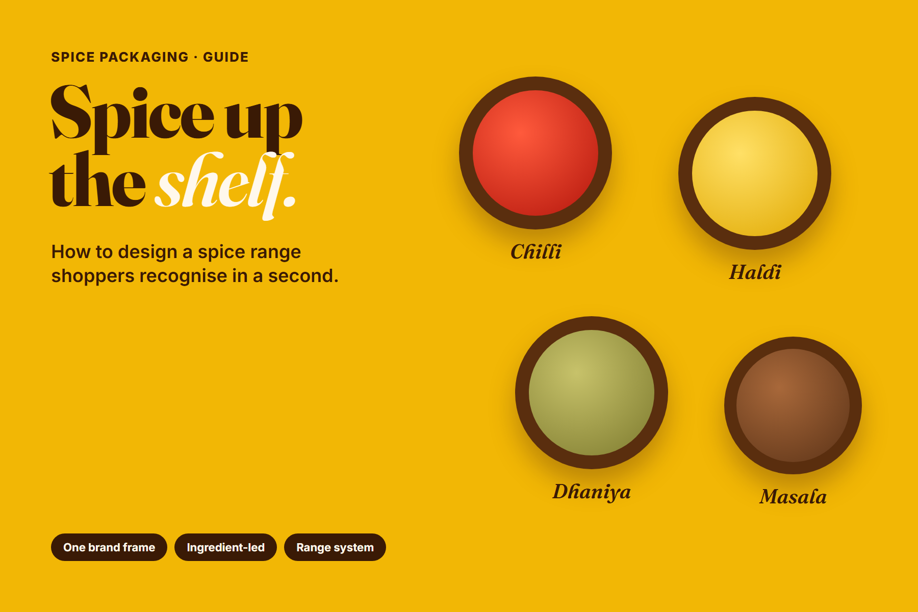
Few categories are as crowded as spices. A single shelf can hold dozens of brands selling the same chilli, turmeric and coriander, often in similar colours and formats. Shoppers rarely compare them carefully. They reach for the pack they recognise, or the one that looks most trustworthy in the moment.
That makes spice packaging a design problem with two parts: help people spot your brand quickly, then help them pick the right spice from your range without reading every word. This guide covers how to solve both.
In spices, the brand gets the shopper to your block. The pack design gets them to the right spice.
Why spice packaging is harder than it looks
- Everyday, low-attention purchases: spices are restocked quickly, often without much thought.
- Similar colours across brands: red for chilli, yellow for turmeric. Colour alone does not set you apart.
- Many variants: a range can grow from four spices to twenty, plus blends and pack sizes.
- Lots of required information: the label must carry dates, price, batch and more, on a small pack.
1. Build one brand frame and never break it
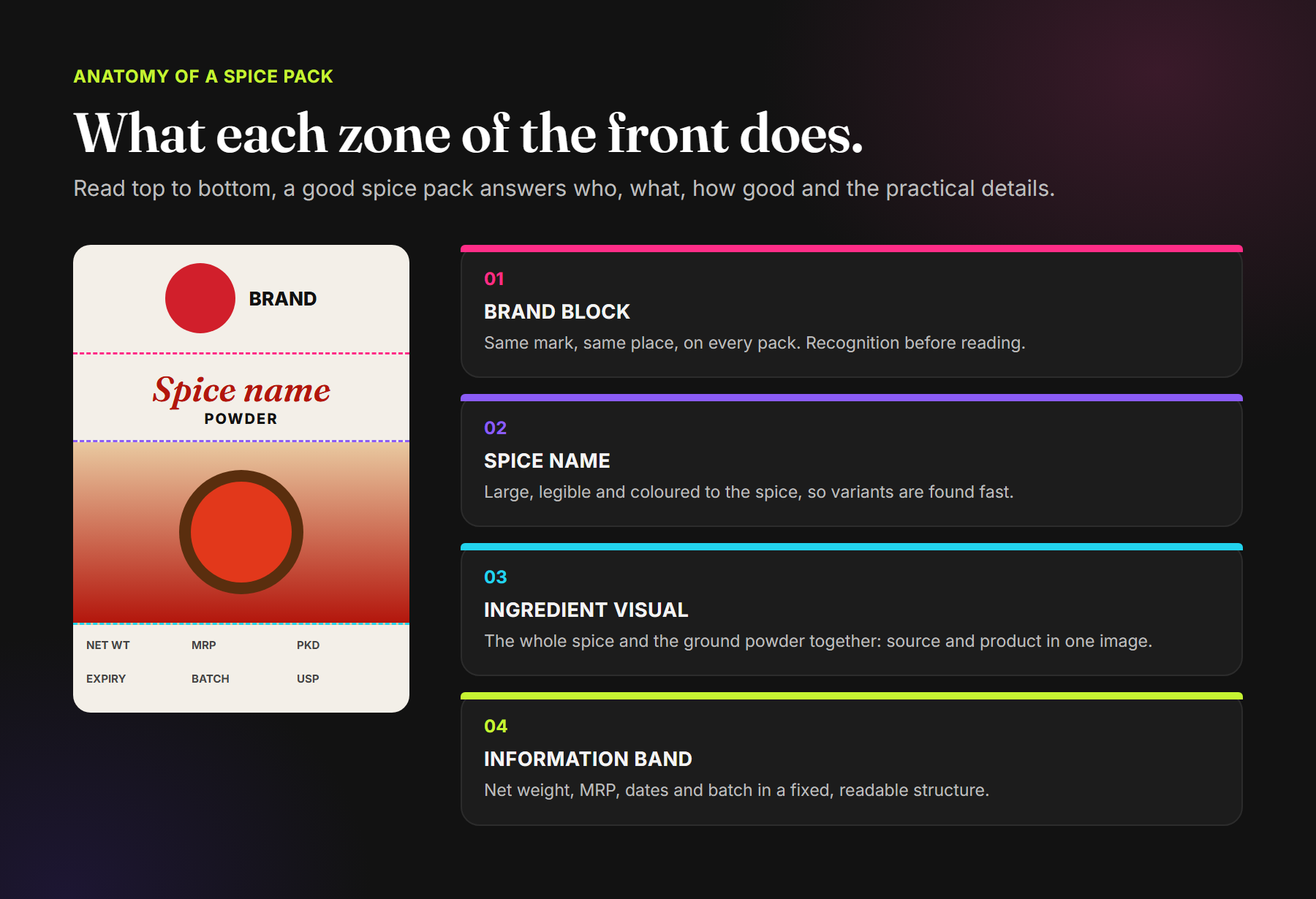
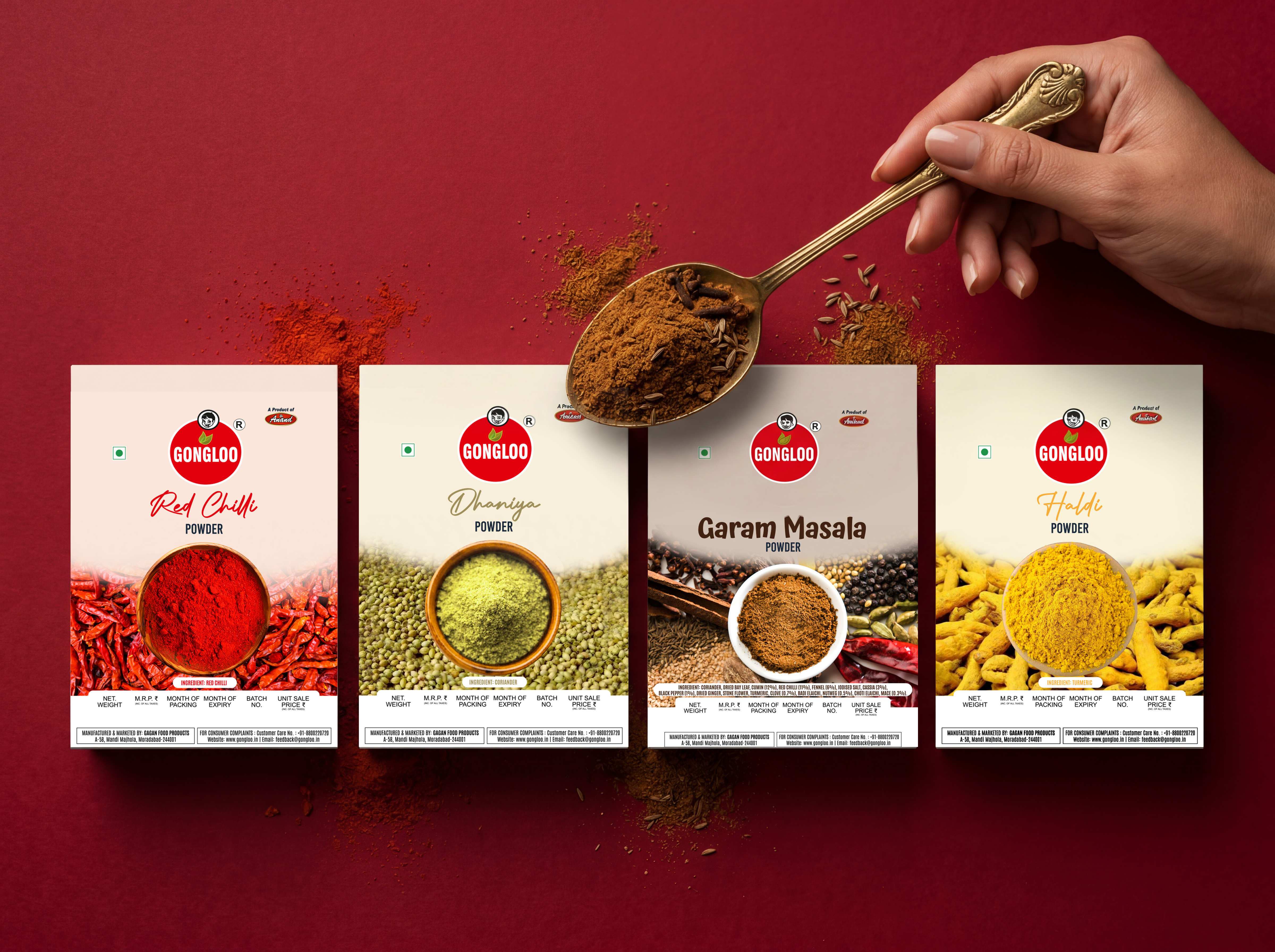
The single most effective decision is a fixed structure that every pack follows: the brand mark in the same position, the spice name in the same zone, the product visual in the same area, and the information in the same band. When every pack shares that frame, the range lines up as a solid block on shelf and becomes recognisable from a distance, before anyone reads the name.
2. Let the ingredient lead
Within the frame, the spice itself is the best way to tell variants apart. Show the ground powder alongside the whole ingredient it comes from: dried chillies behind chilli powder, coriander seeds behind dhaniya, turmeric roots behind haldi. In one image, the shopper sees both what they are buying and where it comes from, which also quietly signals quality.
Use real, appetising photography, lit so the colour of the spice reads correctly. A muddy or oversaturated image makes even a good spice look cheap.
3. Make the spice name easy to find
The spice name should be the largest text after the brand, and readable from arm's length. Many ranges pair an expressive script or display face for the spice name with a plain, steady type for the descriptor (“Powder”, “Masala”). Colouring the name to match the spice adds a second cue that helps shoppers find their variant quickly.
If you sell in regions where shoppers use local names, consider showing both the common local name and the English name, so nobody has to guess.
4. Treat blends differently, within the family
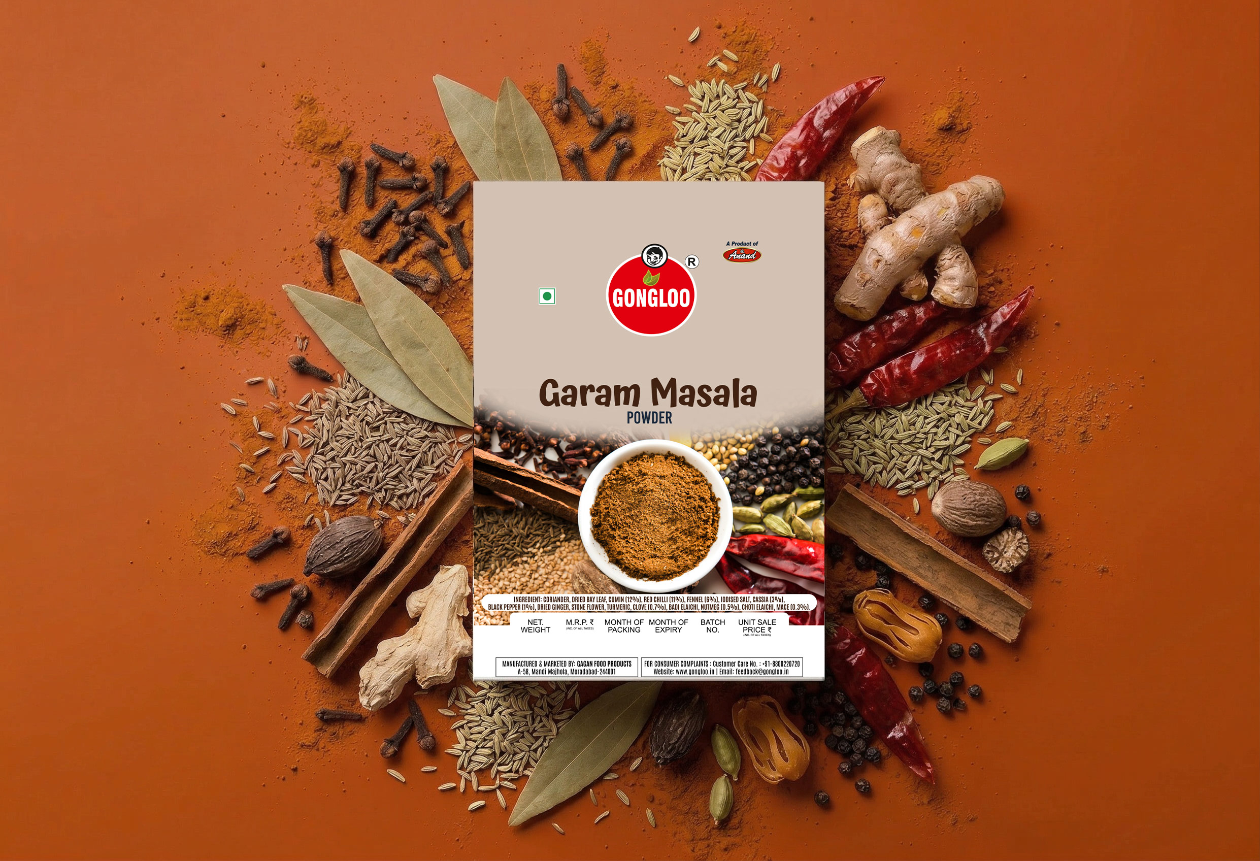
Blends such as garam masala, chaat masala or kitchen king are chosen differently from single spices. Shoppers compare taste profiles and ingredients. Give blends a slightly different treatment while staying inside the brand frame: a bolder name, a collage of the whole spices that go into it, and the ingredient declaration where comparison shoppers will look for it.
5. Design the information band in, not on
Spice packs carry practical details that shoppers and regulators rely on: net weight, MRP, dates of packing and expiry, batch number and consumer-care details, along with the vegetarian symbol and your licence information. When these are left until the end, they end up squeezed and hard to read.
Instead, give them a dedicated, consistent band in the layout from the first sketch. Keep the structure identical across the range so the information is always in the same place. Our guide to food packaging design in India covers labelling requirements in more detail. Always confirm the final label against the current regulations.
6. Plan the range as a system
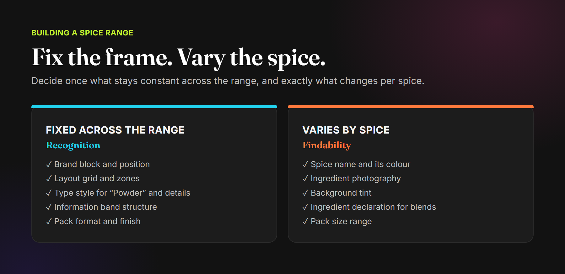
A spice range rarely stays at four products. Decide early what stays fixed across every pack, and exactly what changes per spice. Then adding a new spice becomes a quick, predictable job rather than a fresh design project.
7. Check it on the shelf and on the screen
Before you print, test the design where it will actually be seen. Print mock-ups at real size and look at them from a shelf's distance, next to competitors. Then shrink the front to a thumbnail, as it will appear on quick-commerce apps and marketplaces. The brand and the spice should still be obvious in both. If you sell on Amazon, our guide to Amazon listing images covers how the pack carries into the gallery.
Common spice packaging mistakes
- Every spice looks like a different brand: no fixed frame, so the range never builds a block on shelf.
- Colour as the only cue: red and yellow packs that look like every competitor's.
- Stock-looking photography: generic images that do not show the real product.
- Spice name too small: the brand is loud, but shoppers cannot find their variant.
- Information squeezed in last: tiny, crowded details that are hard to read.
- No plan for new variants: every new spice needs a redesign.
Frequently asked questions
What makes spice packaging stand out on shelf?
A consistent brand frame across the range, a clear spice name, and real ingredient photography. Together they make the brand recognisable from a distance and the variant easy to find up close.
Should every spice in a range have a different colour?
Colour coding helps, but it works best inside a fixed layout. Use the spice's natural colour in the name, photography or background tint, and keep the brand elements the same on every pack.
What information must be on spice packaging in India?
Pre-packaged food labels in India carry details such as the product name, ingredients, net quantity, MRP, date marking, batch number, the vegetarian symbol, FSSAI licence details and consumer-care information. Requirements vary by product, so confirm the final label with the current regulations.
How do I design packaging for a spice blend?
Keep the brand frame, but give the blend its own voice: a bolder name, a visual of the spices that go into it, and a clear ingredient declaration for shoppers comparing blends.
Spice packaging that is spotted first and chosen fast.
Packaging Design · Range Systems · Label Layouts · Print-ready Artwork
See our food packaging work for Tutu Me, ChilliClove and Gongloo, or explore our Brand Launch services.
Comments